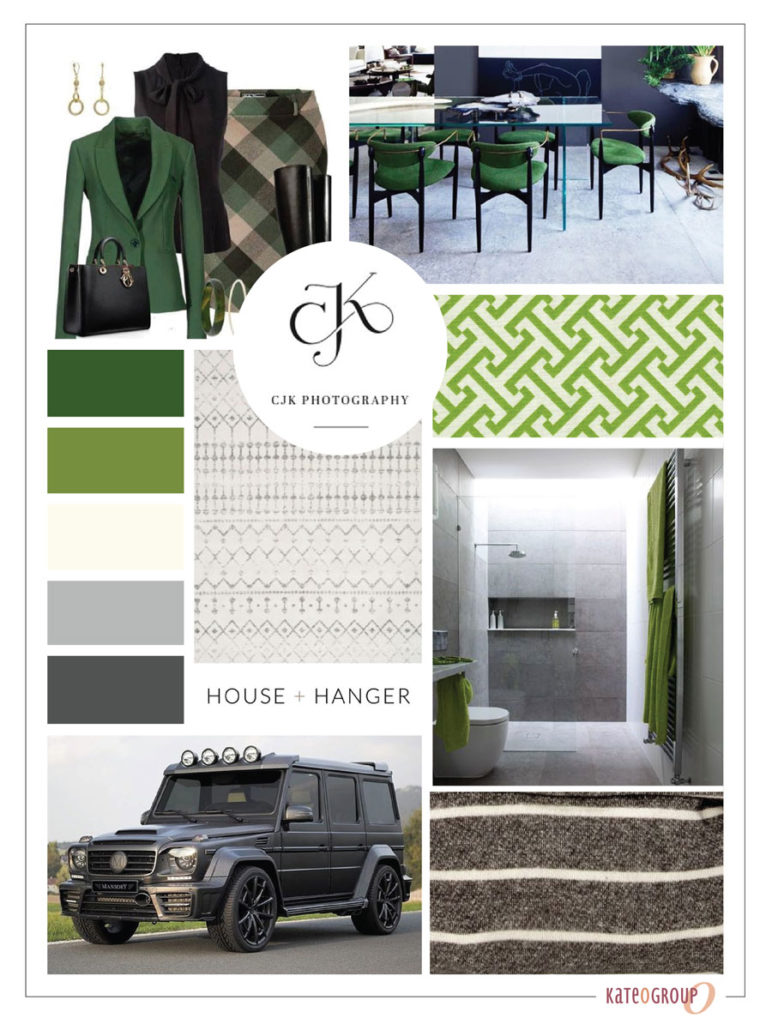
This monogram logo design project for Jennifer Foster started with a quick exchange of ideas over email. I started the project with this moodboard for inspiration.
We often collaborate with Jennifer on various projects. From the design of marketing materials to web design for clients.
Monogram Logo Design
Working with only two initials in a monogram makes it easy to creatively combine the letters. Most of Jennifer Foster Marketing’s clients are corporate. Because of this, she needs her logo to have a clean crips look rather than a whimsical look.
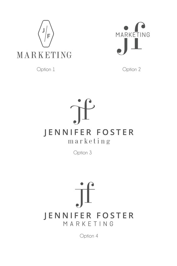
For this logo design project having various mark options is important so that Jennifer always has a version of her logo to use in any situation. For example, social media, letter head, watermarks, etc.
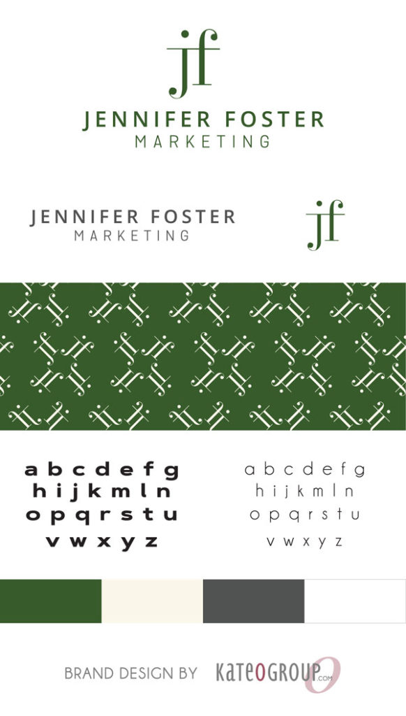
The color scheme for this brand incorporates greens and greys portraying stability and balance. As a result, to me this means authority and expertise. If you are stable and balanced then you can withstand the test of time.
After a few rounds of revisions Jennifer ultimately made her selection for her logo design. Below are the final designs presented to Jennifer before the final selection was made.
Here is a look at the final logo design for Jennifer Foster Marketing:
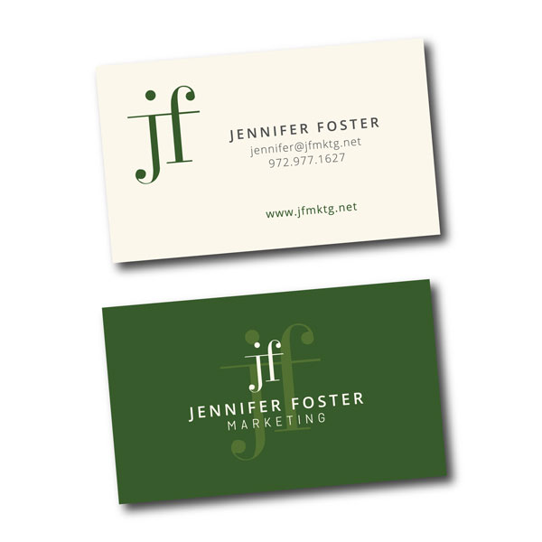
In addition to a logo, Jennifer needs a business card. Just like the logo the design is clean and crisp.
Web Design for Jennifer Foster Marketing
Creating a simple wordpress web design began after the logo selection was made. This site introduces Jennifer Foster Marketing and it’s services. Additionally it allows Jennifer to easily blog.
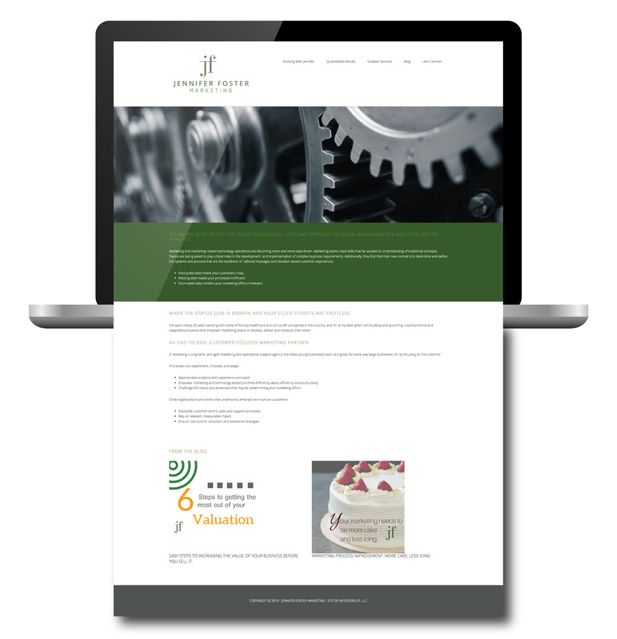
Visit Jennifer Foster’s website for more information about Jennifer and her services. Click here.
Ready to work with KateOGroup

Reader Interactions