• Skip to main content
KateOGroup-Logo
  • Home
  • About
  • Services
    • Custom Branding Design Services by KateOGroup
    • Custom WordPress Website Design
    • Design & Maintenance Services
  • Portfolio
  • Resources
  • Blog
  • Contact

Blog

Jan 02 2026

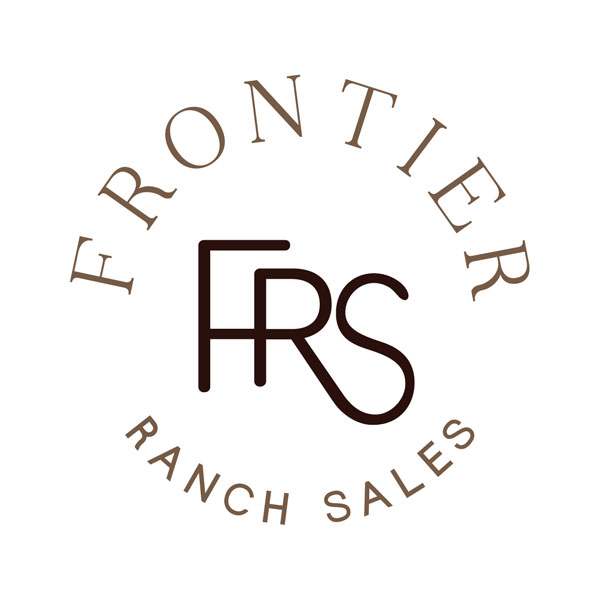
Frontier Ranch Sales Brand Design

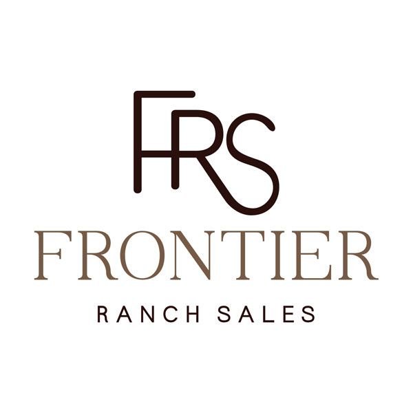
Frontier Ranch Sales Main Logo

A Modern Cattle Brand Design Rooted in West Texas

At KateOGroup, we build strong brands with authenticity, place, and purpose. Our recent western brand design project for Frontier Ranch Sales is a perfect example: blending West Texas heritage with a clean, modern identity that speaks directly to their audience.

Based near Big Bend National Park in West Texas, Frontier Ranch Sales needed a brand that honored ranching tradition while standing out in today’s competitive land and ranch sales market. The result is a bold, timeless visual identity anchored by a logo that draws inspiration from a classic cattle brand.

A Logo Inspired by Ranching Tradition

The final Frontier Ranch Sales logo is designed to resemble a traditional cattle brand: simple, strong, and instantly recognizable. This approach connects directly to the ranching lifestyle while reinforcing trust, legacy, and craftsmanship.

Cattle brands have long represented ownership, pride, and history in the West. By reimagining this symbol through a modern design lens, we created a logo that feels both heritage-driven and professional, making it ideal for signage, print, digital platforms, and merchandise.

Frontier-Ranch-Sales-Mood-Board

Mood Board Inspiration: West Texas Landscapes & Ranch Life

To guide the creative direction, we developed a mood board inspired by the rugged beauty of West Texas. The imagery pulls from:

• Open ranch land and desert terrain
• Weathered leather, wood, and steel textures
• Big Bend’s vast skies and natural greens
• Traditional ranching tools and branding irons

This mood board grounded every design decision, from typography to color, in Frontier Ranch Sales’ mission and values.
Frontier-Ranch-Sales-Brand-Colors

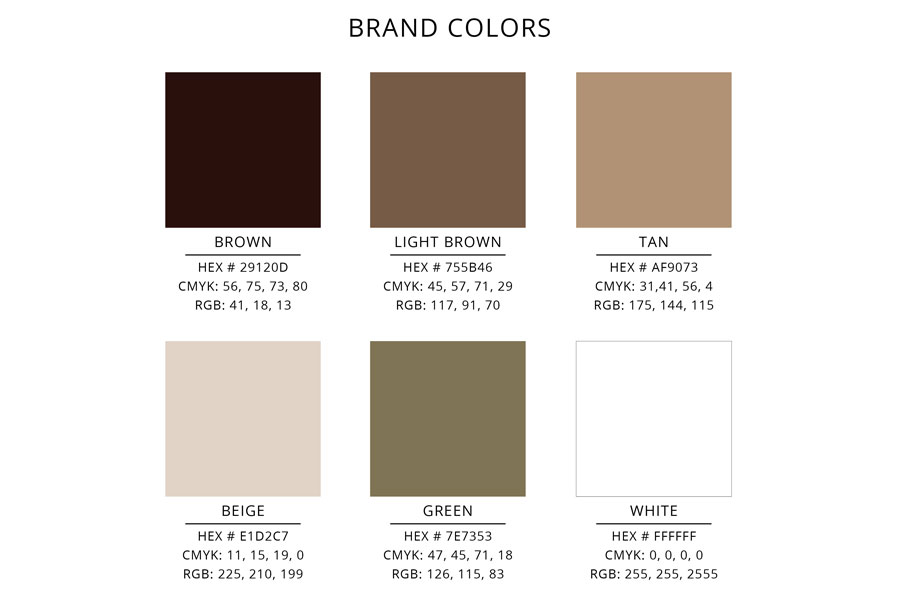
Color Palette: Earthy Browns with a Touch of Green

The Frontier Ranch Sales color palette is primarily rich browns, representing reliability, land, and tradition. We added a subtle hint of green to reflect growth, stewardship, and the natural landscape of Texas.

This combination creates a grounded, approachable brand that feels at home in West Texas while remaining versatile across marketing materials.

Why Brand Design Matters for Ranch & Land Sales

A strong brand design does more than look good; it builds trust and credibility. For businesses like Frontier Ranch Sales, branding helps:

• Establish authority in the ranch and land market
• Create instant recognition across platforms
• Communicate values before anyone reads a single word
• Attract the right buyers and sellers

Thoughtful brand design ensures your business stands out while staying true to its roots.

KateOGroup Brand Design Services

At KateOGroup, our Brand Design Services are tailored to businesses that want more than just a logo. We create strategic, story-driven brands that reflect who you are and where you come from.

Our brand design services include:

• Brand strategy & visual direction
• Logo design & submarks
• Color palette & typography systems
• Mood boards & brand inspiration
• Brand guidelines for consistency

Whether you’re launching a new business or refreshing an existing one, we help you build a brand that’s authentic, memorable, and with longevity.

Ready to Build a Brand That Reflects Your Roots?

The Frontier Ranch Sales brand is a testament to how intentional design can honor tradition while elevating a business for modern audiences. If you’re ready to create a brand that truly represents your story, KateOGroup is here to help.

Learn more about our Brand Design Services and see how we can bring your vision to life.

You can view the western brand design in action on their website.

Written by Kate O. Lynch · Categorized: Blog

Jul 30 2025

Property Management Logo & Website Design

I had the opportunity to work on a Property Management Logo and Website design when they launched.  Preston Trails Property Management is boutique firm specializing in property management for individually owned, single family homes and investment properties.

Property Management Logo Design

The goal with the logo design was to keep it simple.  The inspiration was an old fashioned key.  I was able to use both the initials P and T to create the look of a key.

Preston-Trails-Property-Management-Logo

It was easy to pull a logo mark from this logo for use on social media profiles and the favicon for the website.

Property Management Website Design

The focus of the website design was easy navigation for anyone who visits the website.  We wanted Property Owners and Tenants to both be able to easily access the information they need.  Here is a look at the homepage.

uabb-device-laptop

View our Property Management Logo & Website Design in action:

Visit the Website

Written by Kate O. Lynch · Categorized: Blog, Branding & Design, Website Design

Jun 17 2025

Consulting Website Redesign for Metre22

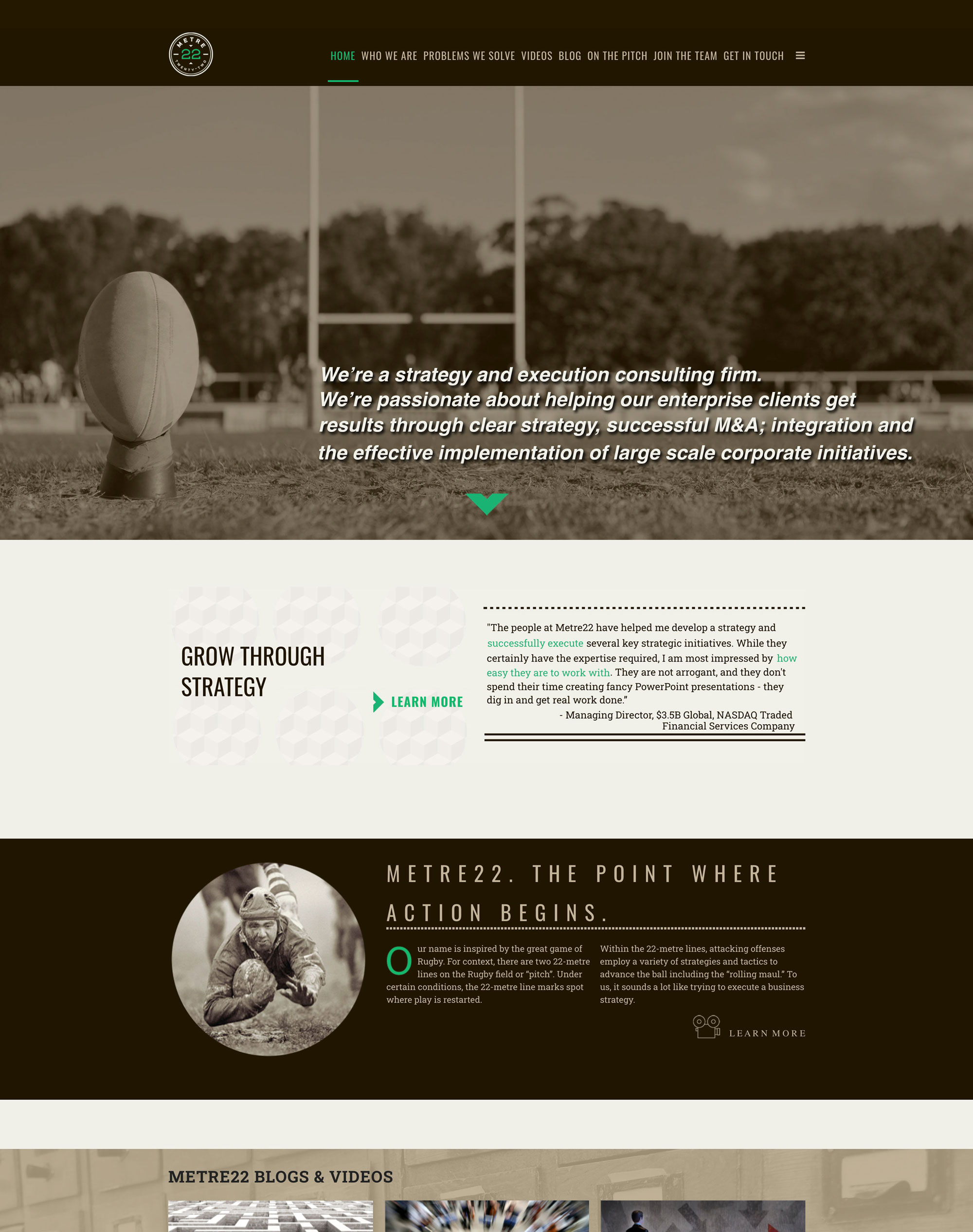
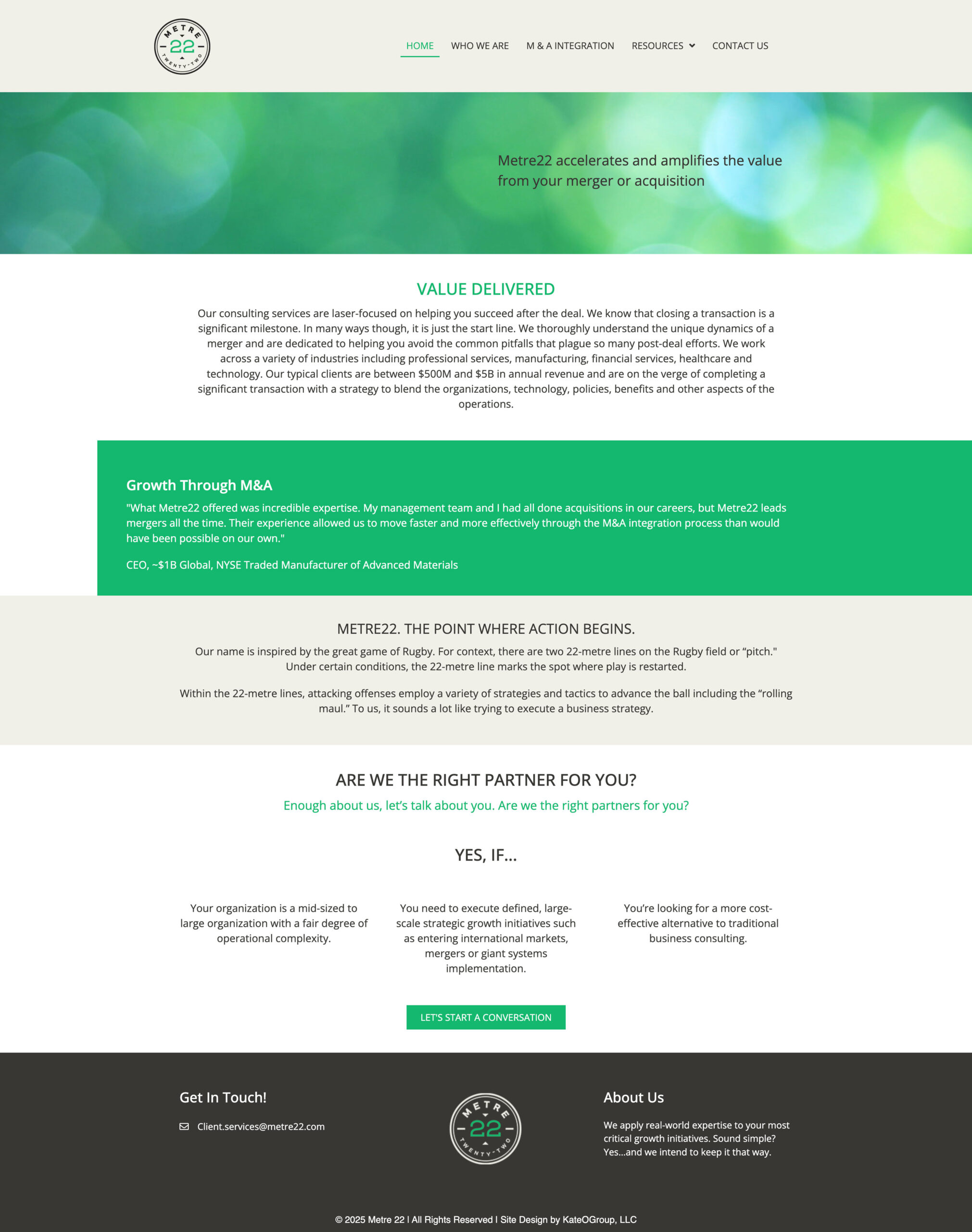
Metre22 is a Dallas based Mergers & Acquisitions Consulting Firm.  KateOGroup worked on this consulting website redesign with a few goals: an updated look, a more concise message and mobile responsiveness.

The new Metre22 website is a WordPress based website.  Below you can compare the previous website to their new site.

One way we achieved the updated look on this Consulting Website was by creating white space.  We focused the messaging on only mergers and acquisitions, then eliminated anything else that was just noise to make the website appear larger.

uabb-device-desktop

Head over to the Metre22 website to take tour of this new and improved Consulting Website.

Transform your consulting agency's online presence with a custom WordPress website redesign. KateOGroup specializes in creating user-friendly, SEO-optimized, and mobile-responsive websites. Websites that elevate your brand, improve lead generation, and enhance client engagement. Whether you're looking for a modern design, faster performance, or better functionality, we tailor every aspect to meet your needs. Get started today and give your consulting business the digital edge it deserves.

Why Hire KateOGroup to Design Your Website:

  • Custom Design – Tailored to reflect your brand and goals.
  • User-Friendly – Clean, intuitive layouts for better engagement and easy to update.
  • Mobile-Responsive – Looks great on phones, tablets, and desktops.
  • SEO-Optimized – Built with search engines in mind to help you get found.
  • Ongoing Support – Help with updates, edits, and maintenance.
  • Conversion-Focused – Designed to drive leads, clicks, or sales.
  • Client-Focused – Clear communication and a collaborative process.
Let's Work Together

Written by Kate O. Lynch · Categorized: Blog, Website Design

Jun 10 2025

Austin Arnold Construction Website Design

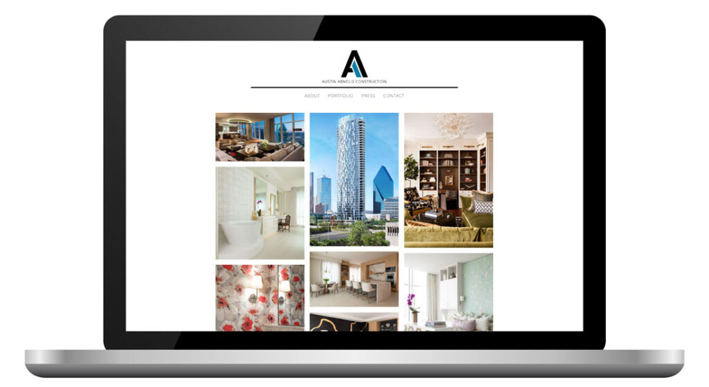
Austin Arnold Construction is a boutique construction company specializing in high-end residential interior finish outs in Dallas, Texas since 2004.

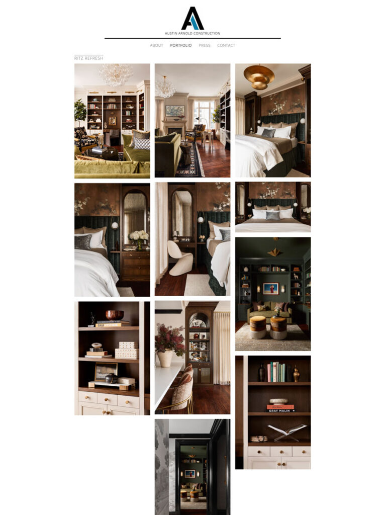
Initially their website was built on Wix, so the first thing we did was move them to the WordPress Platform. The Austin Arnold Construction website design is simple to focus all the attention on the project photos. They do absolutely beautiful work and need a website that shows off what they do!

To see the complete Austin Arnold Construction website design as well as more of their work, visit their new website.

Written by Kate O. Lynch · Categorized: Blog, Website Design

Jun 03 2025

Tristrand Therapy ABA Branding & Website Design

Creating a compelling brand identity is important for any business, and for Tristrand Therapy, a provider of applied behavior analysis (ABA) therapy for children on the autism spectrum in the Dallas/Fort Worth area, this process was particularly significant. Their logo and website needed to reflect their mission of empowering individuals, equipping families, and enabling success.

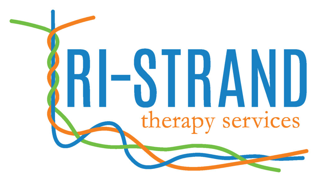
It’s no accident that their mission is made up of three goals, which is reflected in both their name and branding.

From the start of the brand design process I knew the color scheme we were using. The client loved the combination of blue, green and orange. The design for the ABA branding had endless possibilities. The final logo design initially started out like this:

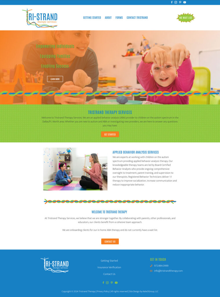
Once the logo was finalized the WordPress website design got underway. During the website design process I created a few additional branding elements. Check them out below:

Tristrand merged with another company in 2025. This you cannot view the website live. But, you can head to our portfolio for additional screen captures from this ABA branding project.

View Portfolio

Written by Kate O. Lynch · Categorized: Branding & Design, Custom Branding, Our Work, Website Design

  • Page 1
  • Page 2
  • Page 3
  • Interim pages omitted …
  • Page 14
  • Go to Next Page »

Get In Touch!

howdy@kateogroup.com

Sign Up to Receive Our Newsletter

!
!
Subscribe
Something went wrong. Please check your entries and try again.

Follow Us

© 2026 KateOGroup | All Rights Reserved