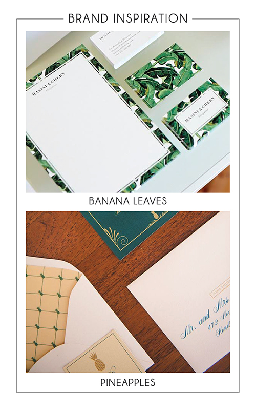
I met Lindsey Edison at the beginning of the year when she asked me to create some graphics for a client of hers. Over the next couple of months more projects have come up and she decided it was time to officially launch her business: Lindsey Edison | Branding & Design. Just as Lindsey does for her clients, she had a clear vision for what her brand and logo design should look like. The inspiration started with two pieces of inspiration she sent me as we began the logo design project.
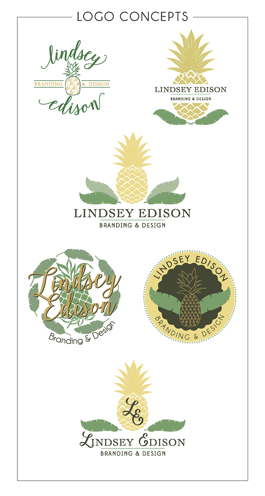
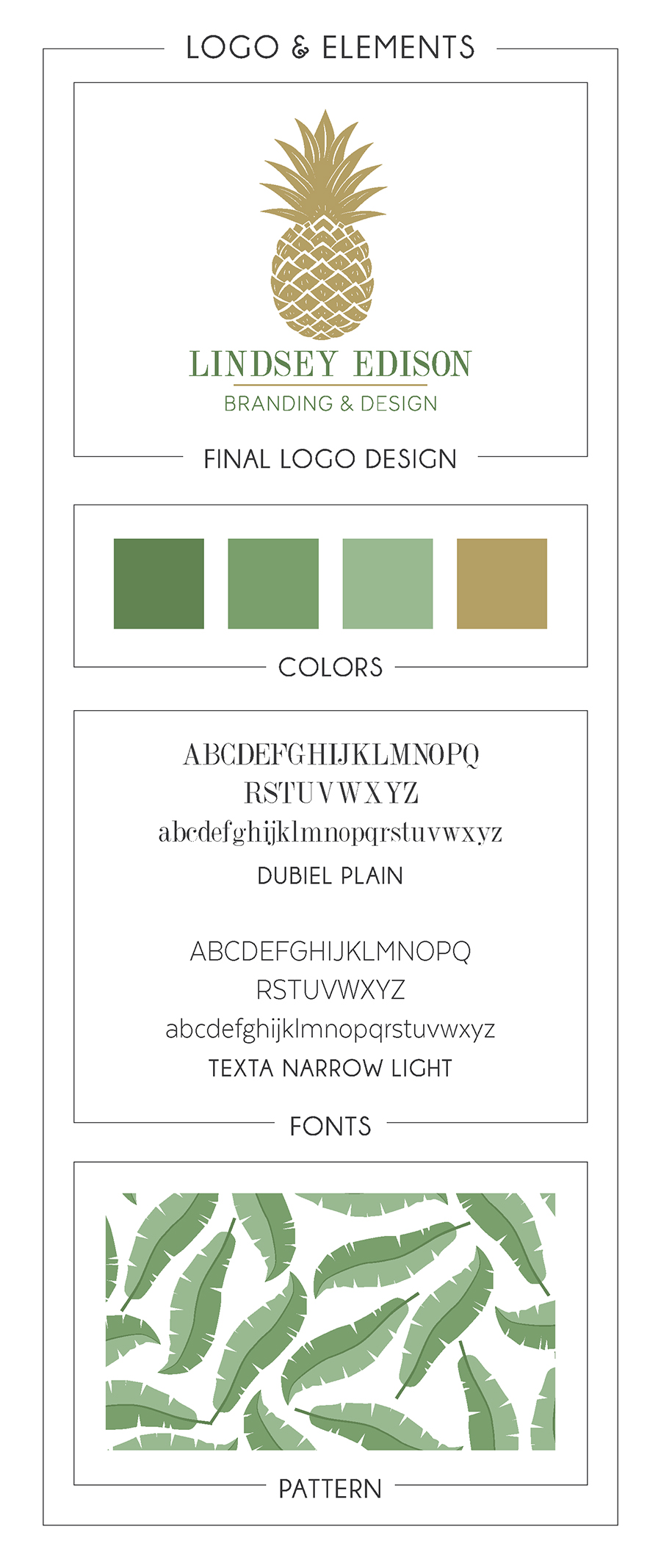
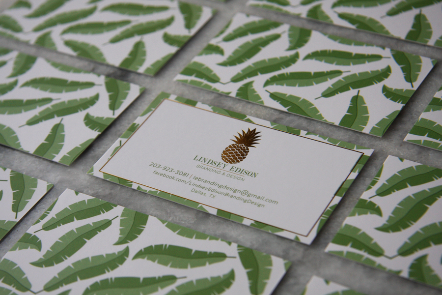
My favorite idea while working on this logo design was using Lindsey’s initials as the texture on the pineapple but ultimately the pineapple was going to be so small that the design didn’t work out as well as I’d hoped. After working through a few concepts we both agreed the banana leaves should just be an element for her brand instead of being incorporated into the logo design. In the end, the final logo design chosen was:
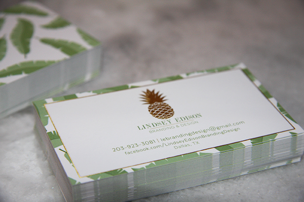
We used gold foil on the front of Lindsey’s business cards and I absolutely LOVE the end result!
Be sure to check out Lindsey Edison Branding and Design over on Facebook to keep up with all of her projects.

Amazing job coming up with such a neat concept! Love it!
These designs look incredible! Beautiful pineapples!
this is so awesome! I love the classic welcoming feel to this brand design!
Love! It’s so interesting to see all what goes into brand design.
These are gorgeous! Great job!