Confession. Every time I complete a project it becomes my favorite project.
Though I have to say it might take a little bit for anything to top this rebrand project. That is simply because I got to do so many things with this project and they were all so much fun!
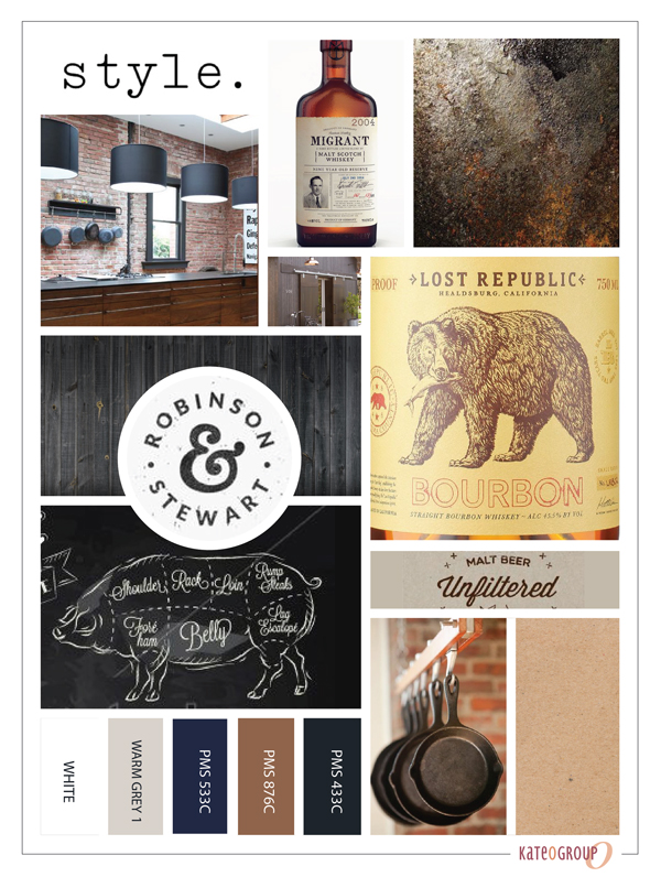
First step of course was determining the mood and style of this rebrand through the moodboard:
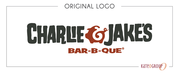
Charlie & Jake’s is a Barbecue restaurant near Florida’s Intracoastal Waterway that relocated this year (just down the street). Along with the relocation the logo got a revamp. The original Charlie & Jake’s logo was a bit whimsical and fun:
With the rebranding the owners where looking for a more modern design that would accompany the expanded menu. We tried several variations with just a pig, with no pig and ultimately decided to incorporate both a big and a cow. Here’s a look at a few of the options we explored as we worked through the design process:
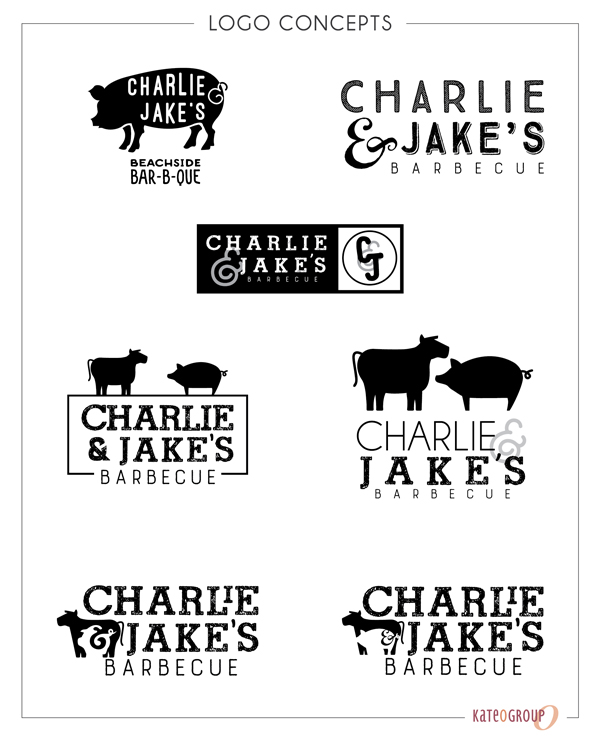
I was so glad I didn’t have to be the one to choose the final logo. I’m not sure I would have been able to decide!
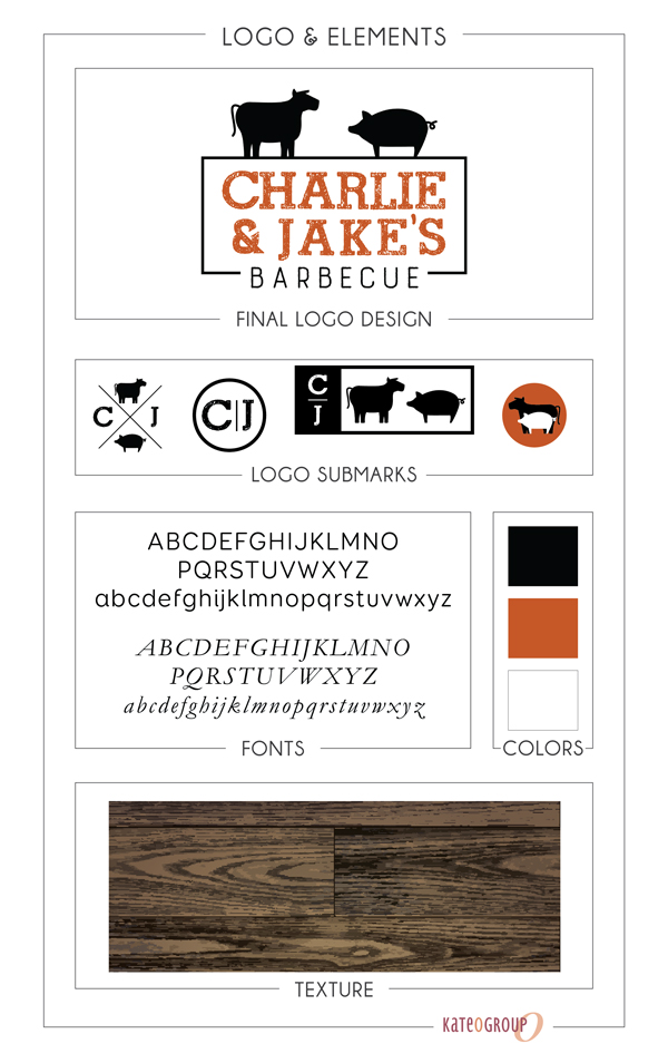
But once the logo was chosen the real fun began!
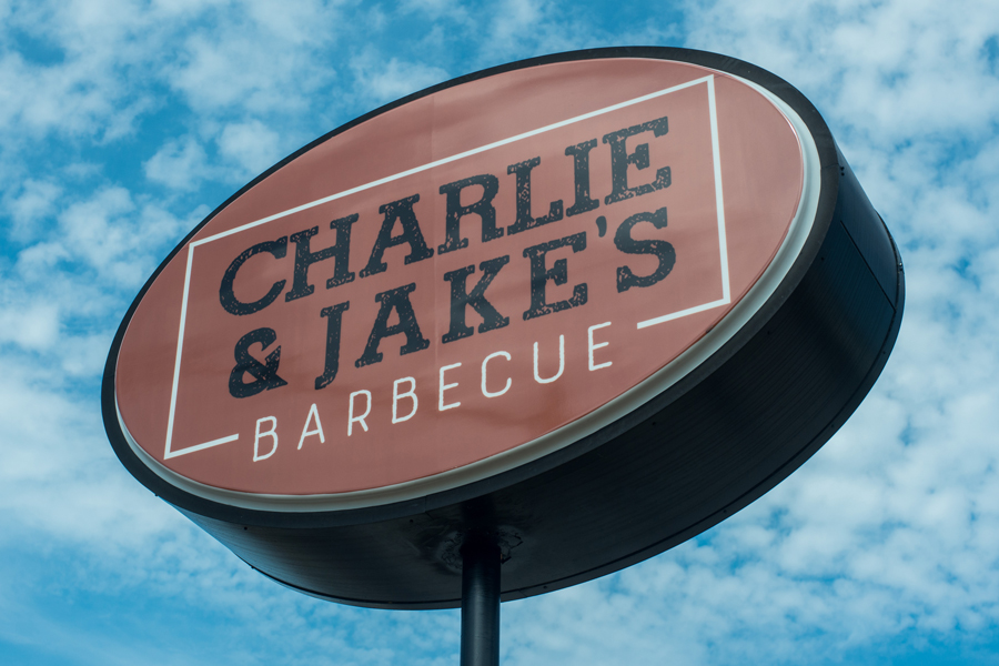
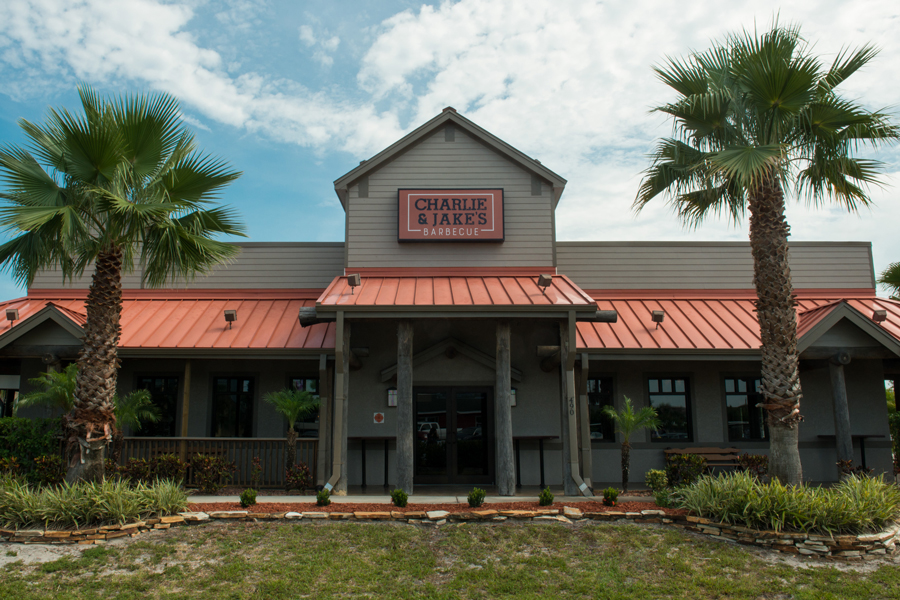
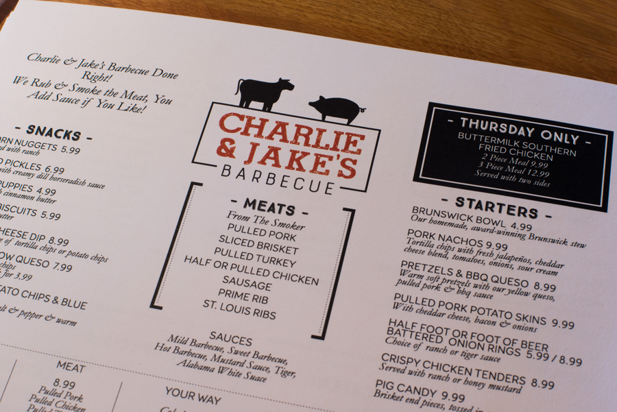
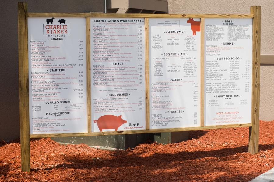
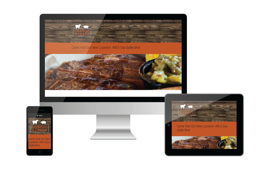
This rebrand included giving the website a new look as well. Be sure to check out the brand new Charlie & Jake’s site. In the mean time here is a look at the home page:
We’ve still have a few more printed items to wrap up so be sure to head to the portfolio because I’ll be adding the additional work there.
Since I live in Texas, no where near Charlie & Jake’s, someone go visit and tell me all about how amazing the food is!
All photos by Yap Originals.

So beautiful! Great work 🙂
Thank you so much Christina!