This jewelry logo design project for Sonya Renee Jewelry was a collaboration with Lindsey Edison Branding & Design. The Sonya Renee Jewelry Rebrand was such a fun project!
Lindsey and I got together over a cup of coffee to brainstorm the colors and style. After perusing Pinterest for inspiration we settled on Rose Gold and black. As we went through the design process the black eventually became more of a dark grey.
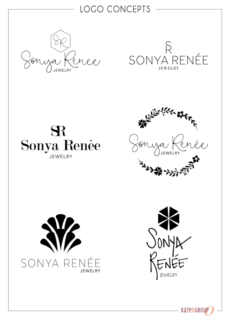
Here’s a few of the initial logo concepts presented to the client:

New Jewelry Logo Design for Sonya Renée
With the logo selected it was time to complete the branding process. This is where the real fun starts!
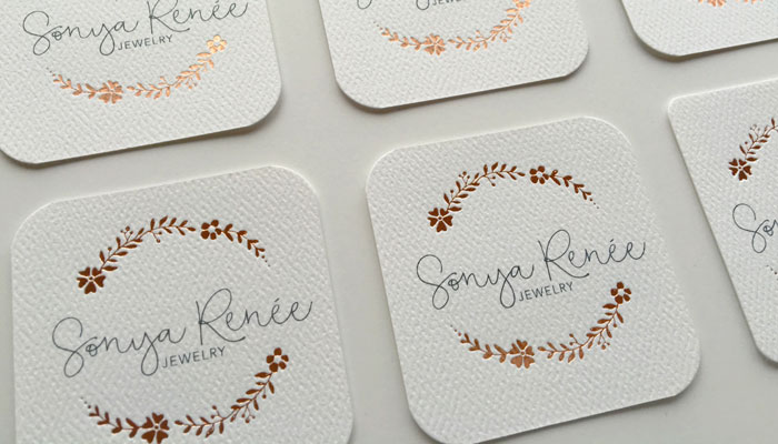
To compliment the gorgeous Rose Gold foil the paper we use for the business cards, stationery and belly bands has this amazing texture. It gives the pieces a bit of a natural look that is balances the foil to give this design an approachable feel.
Heres a look at a few of the additional marketing pieces we created: business cards, packaging and stationery.


In addition to the items above, we also created a look book for Sonya Renee’s first launch following the new jewelry logo design.
The combination of Rose Gold and Pewter gives this Sonya Renee Jewelry Rebrand such a whimsical and feminine feeling. If you need some new jewelry for yourself or for a gift be sure to visit Sonya Renee Jewelry!
Ready to work with KateOGroup

Reader Interactions