• Skip to main content
KateOGroup-Logo
  • Home
  • About
  • Services
    • Custom Branding Design Services by KateOGroup
    • Custom WordPress Website Design
    • Design & Maintenance Services
  • Portfolio
  • Resources
  • Blog
  • Contact

branding

Jun 04 2019

The Color Green

I have always loved the color green but rarely incorporate it into my everyday life. Each year when St. Patrick’s Day roles around I remember just how little green I own.

In brand design, it is important to consider the meaning of the colors you use in your logo and branding elements. Green represents nature, growth, money, fertility and safety. Often companies in the health care industry incorporate green into their logos because it is a relaxing color.

There are endless possibilities when it comes to selecting which shades of green you will use. From yellow-green to dark green the meaning of the color can vary.

Because green is made up of a combination of blue and yellow it embodies characteristics of each. From the color yellow, green draws mental clarity and optimism while from blue, green receives emotional tranquility and insight.

Psychology of the Color Green

Green is an emotionally positive color. Evoking a sense of restfulness, healing, stability and endurance. Green causes observers to feel a sense of balance and stability.

Green in Design

Because of the calming effect green can have you will find varying shades of green incorporated throughout design. In graphic design, often in logos and marketing items for the healthcare industry. In interior design, various textiles and accent items in green are a frequent staple.

KateOGroup utilizes green in branding design and web design often. Here are a few examples:

Front and Back of Lindsey Edison Business Cards

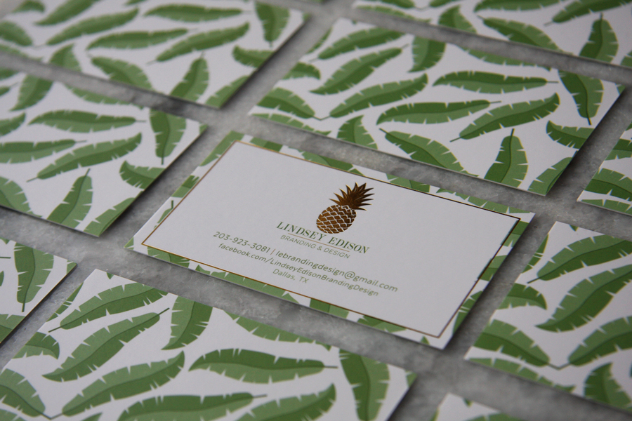
The logo and collateral for Lindsey Edison Branding includes a few shades of green.

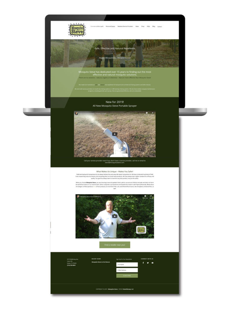
The website for Mosquito Steve also includes a few shades of green throughout the design.

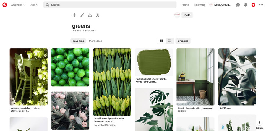
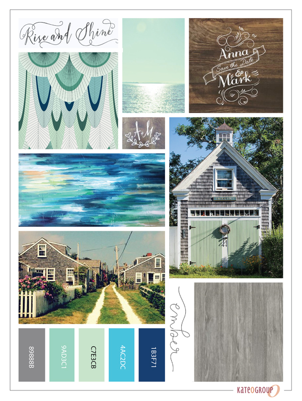
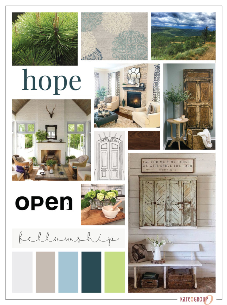
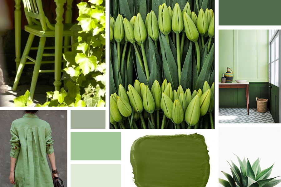
Visit KateOGroup on Pinterest and see our board titled Greens. This board is full of inspiration that is nothing but Green. All of the images in the first image are on the Greens Pinterest Board.

Are you a fan of green?

Written by Kate O. Lynch · Categorized: Blog, Branding & Design, Color · Tagged: brand design, branding, Branding Design, color psychology

Sep 19 2016

Moodboard Monday: Dreamy Sophistication

Moodboards play such an important when I begin a design project.  Whether it’s a logo or a website, this is where I like to start.  The Moodboards I’m sharing today have dreamy sophistication.

I love this Nantucket inspired color pallet.  These weathered wood textures add so much character.

nantucket-moodboard-dreamy-sophistication

This moodboard was so much fun to create. It was designed for a project for a new business in the flooring industry. All of the patterns and textures…I just love the endless possibilities they represent.  As different as the moodboard below is from the one above, to me it also represents dreamy sophistication.

mood-board


Every time I start a new moodboard, the first place I go is to Pinterest.  I start gathering images and bringing them into Illustrator.  As I put them side by side I can see if they really create the story I’m trying to create for my customer.  Do they evoke the look and feel the brand represents?  I typically have a color pallet in mind when I start a project but it evolves as the moodboard comes together.

Written by Kate O. Lynch · Categorized: Blog, Branding & Design · Tagged: brand design, branding, flooring, logo design, moodboard, moodboard monday, nantucket

Jun 21 2016

Instagram for your Brand

Instagram for your Brand

I am constantly striving to up my Instagram game but am by no means an Instagram expert. With that said, I’ve found some pretty basic concepts to help you Instagram for your brand.  These 8 tips have consistently helped my account grow and work for me, and I wanted to share them.  I am not promising over night success but you’ll be able to Instagram for your brand with more purpose if you implement these.

Here’s a look at my Instagram profile and feed.  Click on the image to visit my profile and be sure to follow KateOGroup!

KateOGroup Instagram Feed

1. Post Consistently
You need to post everyday. If you aren’t putting your company in front of potential customers and fans, then who is?

2. Use Similar Lighting
Whether you’re going for light or bright, be consistent. Be sure to take a look at not just your individual posts but on your entire feed. Do your photos compliment each other? Or does your feed look chaotic? For some of you using bright colors in each photo is your way of being consistent.

3. Do Unto Others as You Would Like Done to You
Like and comment on other people’s posts, this is how you’ll build a a community. Plus if you aren’t liking and commenting on posts why would people do that to your posts?

4. Think Before You Post
Be mindful about your posts. Make sure they are sending a message that explains and introduces people to your brand.

5. Mix in a Little Personality
Even though this is your business account, be sure to show your face every once in awhile and even glimpses into your life or behind the scenes. This helps people get to you know you.

6. Use all 30 Hashtags
I know it sounds extreme but it’s worth it. Experiment a little and figure out which ones work best for you. A little trick I got from my sister, keep your hashtags in a note and copy and paste them on your photos. Be sure and add the hashtags ASAP after you post your image. I like to copy them before I actually post my image so then I can immediately paste them into a comment. If you wait too long to add hashtags you lose the added benefit of posting them. Below is an example of how I post my hashtags.

KateOGroup-Hashtags

7. Study Other People’s Feeds
Look through the feeds you find yourself drawn to and really think about why and then figure out how to apply it to your own feed.  These are 3 feeds I absolutely love! (Click on the image and visit their feeds in person and don’t forget to show them some love!)

[one-third-first]Stephanie-Gilbert-Instagram-Feed[/one-third-first][one-third]Whitv-Instagram-Feed[/one-third][one-third]Emily-Wells-Instagram-Feed[/one-third]

Can you tell I’m a fan of muted colors and lots of white?

8. Join a Challenge
Look around and see if there are any challenges starting or already underway that work with your brand. This will be a great way to gain exposure and connect with new people.

Have you tried any of these tips? Do you find them successful as you Instagram for your brand? Let me know what works best for you in the comments below.

Written by Kate O. Lynch · Categorized: Blog, Business · Tagged: brand strategy, branding, Instagram, instagram for your brand, instagram strategy

May 04 2016

DIY Logo Design

DIY-Logo-Design

After deciding the name of your business, you need to begin the process of branding.  A logo is the first step toward branding your new business and it’s important you set yourself up for success even if you don’t have the money to hire a professional…yet.  I recommend hiring a professional to design your logo and help you create your brand, not just because that is what I do, but because they will have the experience needed to get you started on a strong foundation.

If you need to start with a DIY logo in the beginng then I have some suggestions to help you get started in the right direction.

Play it Safe

A black and white logo is the safest way to start.  Color can easily be introduced down the road.  Rather than having to rebrand later you could simply add color to your current logo that way you retain your established brand and the following you’ve work so hard to create for your brand.

Less is More

Don’t worry about incorporating a symbol or emblem just stick with a font initially.  Here’s where you have to make a decision: script, handwritten, serif or san serif?  Above all, make sure the font is easy to read.

Choosing-a-Font

Stay away from trends

Start with a clean and classic logo.  You can always add to the logo later and dress it up when you are ready to hire a designer to transform your logo with a brand design.

By the end of May, KateOGroup will be offering pre-designed logos that can be customized to fit your company name and to the colors of your choice.  These designs will only be sold once so you don’t have to worry about seeing it anywhere else!

Want to be the first to know when these designs are available?  Sign up for our Weekly Notes through the form below:

Sign Up to Receive Weekly Notes

* indicates required


Written by Kate O. Lynch · Categorized: Blog, Branding & Design, Business · Tagged: branding, DIY Branding, DIY Logo, How to DIY Logo Design, New Business, small business

Mar 21 2016

Moodboard Monday: Homey

Whenever I’m brainstorming a new project, I like to start with a moodboard.  It really helps me to establish the direction and message for the upcoming design.  I haven’t meet with my clients yet, so I’m not sure this moodboard will be what I use going forward but still thought I’d share it incase it provide inspiration for someone else!

Homey_Moodboard

Through this moodboard I wanted to establish a “homey” feel with the opportunity for personal touches throughout the design.  This is the first step in a rebranding and website design.

Want to see even more sneak peeks of the projects I’m working on?

Follow me on Instagram

or Snapchat: KateOGroup

Written by Kate O. Lynch · Categorized: Blog, Branding & Design · Tagged: brand design, branding, Branding Design, logo design, moodboard

  • Page 1
  • Page 2
  • Go to Next Page »

Get In Touch!

howdy@kateogroup.com

Sign Up to Receive Our Newsletter

!
!
Subscribe
Something went wrong. Please check your entries and try again.

Follow Us

© 2025 KateOGroup | All Rights Reserved