• Skip to main content
KateOGroup-Logo
  • Home
  • About
  • Services
    • Custom Branding Design Services by KateOGroup
    • Custom WordPress Website Design
    • Design & Maintenance Services
  • Portfolio
  • Resources
  • Blog
  • Contact

branding

Nov 03 2015

Logo Design: Merrill B. Domas

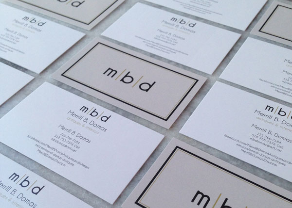
The Logo Design for Merrill B. Domas was another project I worked on with Lindsey Edison Branding & Design.  The idea and concept for Merrill B. Domas Antiques & Interior Design was centered around art deco design and using classic colors.  This was such a fun design I went about over the top on design ideas, but here’s a peek at that final five designs:

Logo Design: Merrill B. Domas Concepts

Merrill-B.-Domas-Logo-&-Elements

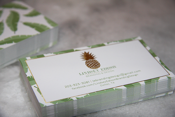
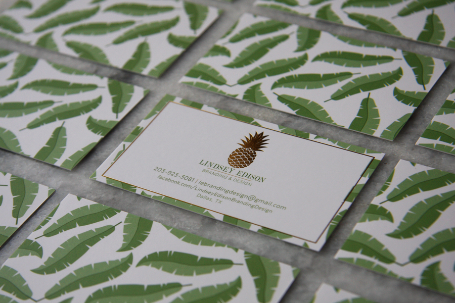
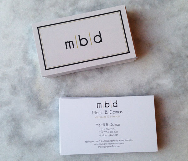
Once the logo design was complete it was time for the business card design.  I love the minimalist look of this modern design and how that translated to the finished card design.

Merrill-B-Domas-Business-Cards-1

Merrill-B-Domas-Business-Cards-2


If you are looking to get started on branding for your business we would love to talk with you.  Leave a comment below and I will email you to set up a time to talk.

Written by Kate O. Lynch · Categorized: Blog, Custom Branding · Tagged: art deco, black and gold, branding, Branding Design, business card design, business cards, logo design, retro logo

Sep 17 2015

Logo Design: Lindsey Edison

I met Lindsey Edison at the beginning of the year when she asked me to create some graphics for a client of hers.  Over the next couple of months more projects have come up and she decided it was time to officially launch her business: Lindsey Edison | Branding & Design.  Just as Lindsey does for her clients, she had a clear vision for what her brand and logo design should look like.  The inspiration started with two pieces of inspiration she sent me as we began the logo design project.
Lindsey Edison Logo Inspiration
Lindsey Edison Logo Concepts

My favorite idea while working on this logo design was using Lindsey’s initials as the texture on the pineapple but ultimately the pineapple was going to be so small that the design didn’t work out as well as I’d hoped.  After working through a few concepts we both agreed the banana leaves should just be an element for her brand instead of being incorporated into the logo design.  In the end, the final logo design chosen was:

Lindsey Edison Logo and Elements

We used gold foil on the front of Lindsey’s business cards and I absolutely LOVE the end result!

Up close of Lindsey Edison Branding and Design Business Cards

Front and Back of Lindsey Edison Business Cards

Be sure to check out Lindsey Edison Branding and Design over on Facebook to keep up with all of her projects.

Written by Kate O. Lynch · Categorized: Blog, Custom Branding · Tagged: Brand Elements, branding, Branding Design, gold foil, logo design

Aug 20 2015

What I’m working on: Mood Board + Branding

When I was approached to create a logo and website for Newport Coast Property Maintenance, my mind immediately went to blues, browns and whites. These colors make me think about the beach. With that in mind here is the mood board I created for the project:

Mood Board Inspiration Newport Coast Property Management

Along with the tranquil colors, I always wanted to bring in a few high-end textures and elements like the marble tile, marble and decorative wood accents.

The website should be ready in the next week and when I launch it I’ll be sharing with the logo design and discarded designs as well as the website it’s self.   This mood board is so much fun it has made developing the site easy!

Want to see more that inspires me?  Head over to my Pinterest account.

Written by Kate O. Lynch · Categorized: Blog, Branding & Design · Tagged: branding, KateOGroup, logo desing, mood board, website design

Aug 03 2015

Logo Design: Vee’s Bakeshop

The logo design for Vee’s Bakeshop was a lot of fun to design. Veronica had a vision that was easy to bring to life.  She wanted to keep the color scheme simple and stick with a predominately black and white logo design.  Here were the four logo design concepts I presented to Veronica.

Vee's Bakeshop Logo Design Options

After looking over these initial designs there were only a few tweaks and ultimately she settled on:

Vee's Bakeshop Final Logo Design


Once the logo was chosen the next step was a business card design.  Right now Vee’s Bakeshop doesn’t have a website but you can find her on Instagram and see all of the sweet treats she’s baking!

Written by Kate O. Lynch · Categorized: Blog, Custom Branding · Tagged: bakeshop, branding, business cards, cupcakes, Dallas business, graphic design, logo design, small business owner

  • « Go to Previous Page
  • Page 1
  • Page 2

Get In Touch!

howdy@kateogroup.com

Sign Up to Receive Our Newsletter

!
!
Subscribe
Something went wrong. Please check your entries and try again.

Follow Us

© 2025 KateOGroup | All Rights Reserved