• Skip to main content
KateOGroup-Logo
  • Home
  • About
  • Services
    • Custom Branding Design Services by KateOGroup
    • Custom WordPress Website Design
    • Design & Maintenance Services
  • Portfolio
  • Resources
  • Blog
  • Contact

design inspiration

Aug 01 2019

The Color Red

The color red is a very intense color that can evoke a wide range of emotions. From passion to anger, red really encompasses quite a lot of feelings.
Psychology of The Color Red

Red is the color most closely associated with energy, passion, and action. It is a warm color that represents power and courage. It is also assertive, daring, determined, powerful, enthusiastic and aggressive.

On the negative side red can represent rage, danger and stress. Being surrounded by too much red can make you irritable, agitated and even angry. 

Red has been my favorite color for as long as I can remember. However, I prefer to work it in as an accent around my house rather than as the focal color. Or even as accessories like my purse or wallet.

The Color Red in Design

Because of the intensity of the color I cautiously use it in branding. Much like in interior design, I think red makes a good accent in branding. Bringing in the passion of red without it’s intensity. One example of this is the updated logo and web design for Barron Custom Design.
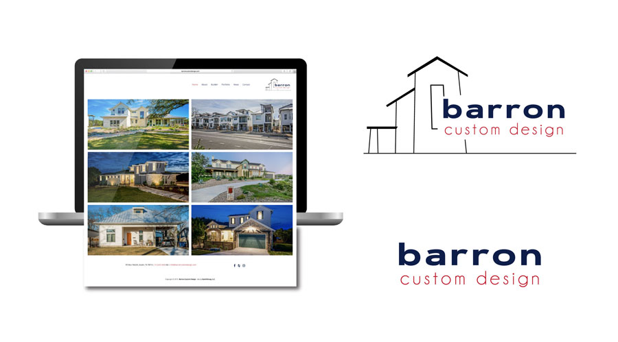
Finding Red Inspiration

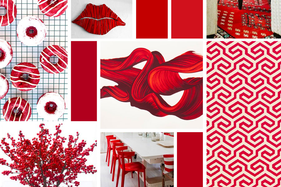
Visit KateOGroup on Pinterest and see our board titled Reds. This board is full of inspiration. Nothing but shades of red. All of the images in the first image are on the Reds Pinterest Board.
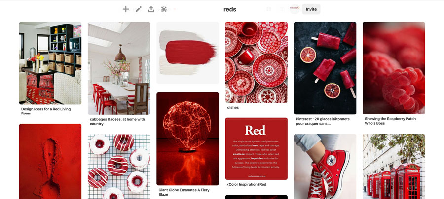
The Color Red Pinterest Board

Over the next month we will be highlighting designs by KateOGroup, both branding and website, that incorporate the red. Be sure to follow us on Instagram.

How do you feel about red?

Written by Kate O. Lynch · Categorized: Blog, Branding & Design, Color · Tagged: Branding Design, color psychology, design inspiration

Jul 01 2019

The Color Navy

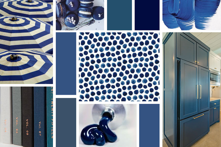
The color navy is one of my favorite colors. I often prefer to use it instead of black because it is a good neutral color that pairs well with other colors.

Psychology of The Color Navy

Blue represents both the sea and the sky, with an association to wide open spaces. Think freedom, imagination, expansiveness, inspiration, intuition, and sensitivity. It represents loyalty, sincerity, wisdom, confidence, stability, faith, and intelligence. It is one of the most widely used shades of blue around the world.

Navy adds an element of sophistication that other shades of blue do not have.

Colors play an important part in the branding process. It is important to take into consideration the colors you use in your logo and their meanings.

Blue is the number one choice for a favorite color. Because of it’s popularity you will often see it in logo designs. It creates a personal connection and helps the brand relate to the largest amount of people possible.

The Color Navy in Design

Navy is a timeless, gender-neutral color that fits in everywhere. It doesn’t call attention to itself through print and digital design.

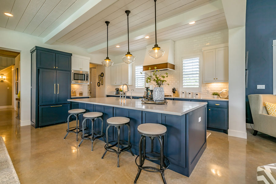
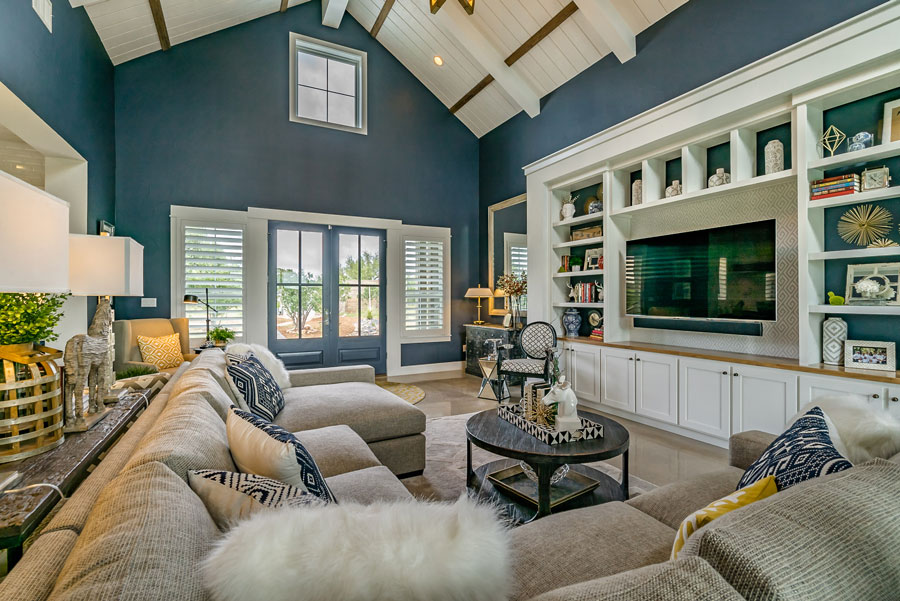
As you can see below, in photos from our client Agave Custom Homes, navy is a popular color to use in interior design. Navy is often seen in both paint and textiles in interior design.

Both of the above images are by Mark Adams Media from a home by Agave Custom Homes.

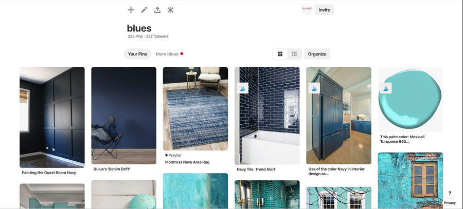
Visit KateOGroup on Pinterest and see our board titled Blues. This board is full of inspiration. Nothing but shades of blue, including navy. All of the images in the first image are on the Blues Pinterest Board.

Over the next month we will be highlighting designs by KateOGroup, both branding and website, that incorporate the color navy. Be sure to follow us on Instagram.

Are you a fan of navy?

Written by Kate O. Lynch · Categorized: Blog, Branding & Design, Color · Tagged: Branding Design, color psychology, design inspiration

Jun 27 2016

Moodboard Monday: Projects in Progress

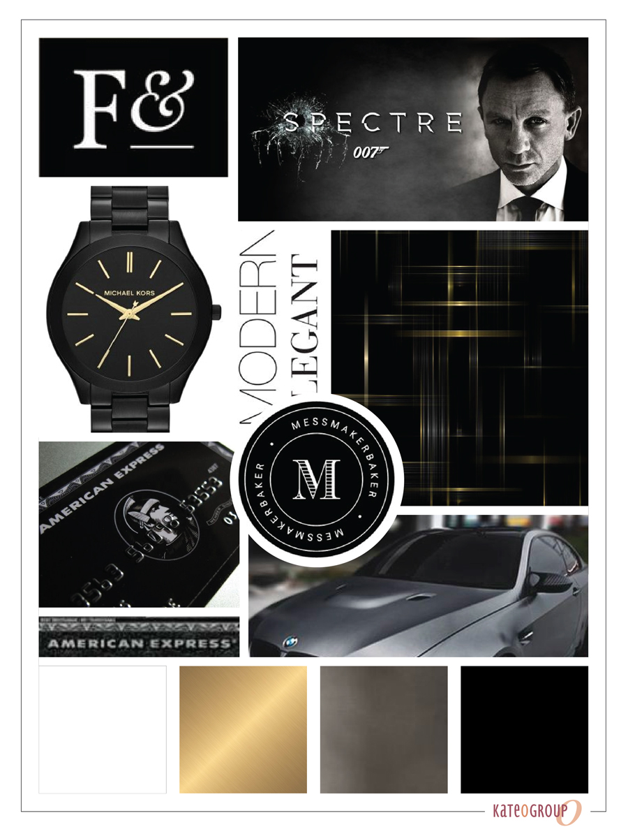
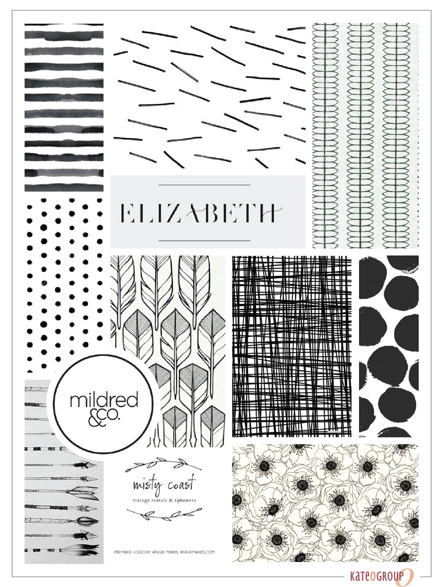
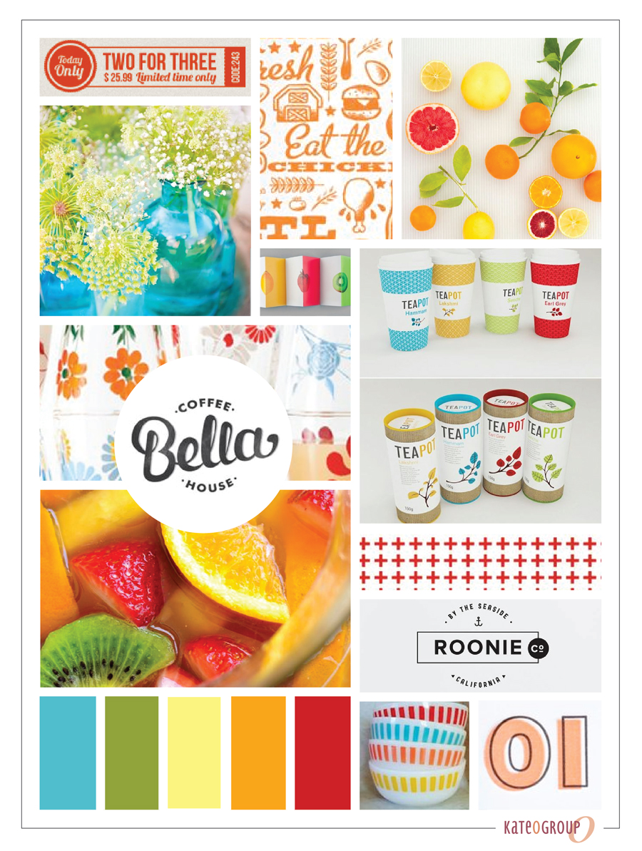
I’m currently working with several clients and on a project for myself that I’ll be sharing more details about down the road but for now, I wanted to share each projects’ moodboard and hope to inspire you with any projects you are working on.  I love how much variety there is in each project!

Family-Office-Management-Mood-Board

The above moodboard is for a branding and website design project for a wealth management company.  We are just about finished with this project and I can’t wait to share the design details and printed collateral.

Shiloh-Boutique-Moodboard

This moodboard is the branding of an online boutique.  This project is just getting started so it will be a little bit before I can share all of the details with you.

KOG-Promotions-Mood-Board

This moodboard is for a new KateOGroup project and needed to gather inspiration as I think through all the details and logistics of the project.  Stay tuned for more details on all 3 of these projects.

The best way to keep up with all that I’m doing is to follow me on Instagram!

Written by Kate O. Lynch · Categorized: Blog, Branding & Design · Tagged: behind the scenes, brand design, design inspiration, moodboard

Get In Touch!

howdy@kateogroup.com

Sign Up to Receive Our Newsletter

!
!
Subscribe
Something went wrong. Please check your entries and try again.

Follow Us

© 2026 KateOGroup | All Rights Reserved