• Skip to main content
KateOGroup-Logo
  • Home
  • About
  • Services
    • Custom Branding Design Services by KateOGroup
    • Custom WordPress Website Design
    • Design & Maintenance Services
  • Portfolio
  • Resources
  • Blog
  • Contact

rebrand

Mar 08 2019

Rebrand: Barron Custom Design

Austin, TX Design Firm Rebrand for Barron Custom Design. Barron designs gorgeous homes throughout the Texas Hill Country. We have been working with owner Felicia and Barron Custom Design since 2013.

In 2013, Felicia wanted a logo and updated website.  This was such a fun project because we incorporated Felicia’s very first custom home design into the logo design. 

Design Firm Rebrand

The updated logo still contains the home design but with a few less details and is now paired with a sleeker cleaner font to give it a modern look.

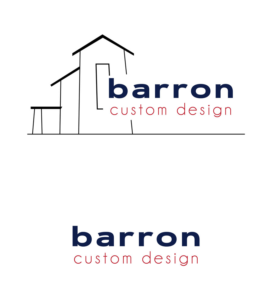
I absolutely love the end result of the updated logo.

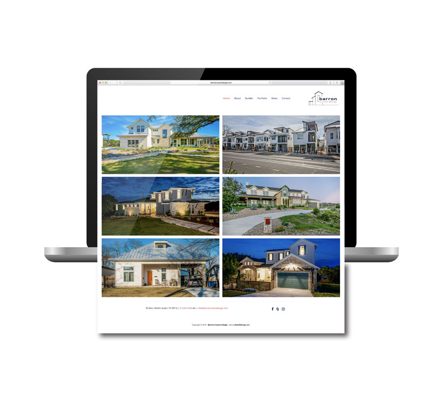
Once the logo update was complete it was time to update the website.  This time we wanted the website to have a minimalist feel with an emphasis on the images of each project.  If you look through the portfolio, you will notice that Barron Custom Design has designed a ton of homes throughout Austin and the surrounding areas. 

It has been such a pleasure to work with Barron Custom Design over the last six years. To not only see all of their designs come to life but also to watch as the company has grown.  We’re honored that we got to be a part of their rebrand. From giving their logo a refresh, to redesigning their website. 

Let’s be honest, we love any excuse to look at beautiful homes! If you want to take a look at the logo and website project from 2013, visit our blog post about the project.

Written by Kate O. Lynch · Categorized: Blog, Custom Branding, Our Work, Website Design · Tagged: rebrand, Website, Website Redesign

Jul 13 2016

Rebrand: Charlie & Jake’s

Confession.  Every time I complete a project it becomes my favorite project.

Though I have to say it might take a little bit for anything to top this rebrand project.  That is simply because I got to do so many things with this project and they were all so much fun!

First step of course was determining the mood and style of this rebrand through the moodboard:
Charlie-&-Jake's-Mood-Board
Charlie & Jake’s is a Barbecue restaurant near Florida’s Intracoastal Waterway that relocated this year (just down the street).  Along with the relocation the logo got a revamp.  The original Charlie & Jake’s logo was a bit whimsical and fun:
Charlie-&-Jake's-original-logo
With the rebranding the owners where looking for a more modern design that would accompany the expanded menu.  We tried several variations with just a pig, with no pig and ultimately decided to incorporate both a big and a cow.  Here’s a look at a few of the options we explored as we worked through the design process:
Charlie-&-Jake's-Logo-Concepts
I was so glad I didn’t have to be the one to choose the final logo.  I’m not sure I would have been able to decide!

Charlie-&-Jake's-Logo-&-Elements

But once the logo was chosen the real fun began!

Charlie-&-Jake's-Street-Sign

Charlie-&-Jake's-Restaurant-Outside

Charlie-&-Jake's-Menu

Charlie-&-Jake's-Drive-Thru-Menu

This rebrand included giving the website a new look as well.  Be sure to check out the brand new Charlie & Jake’s site. In the mean time here is a look at the home page:

Charlie-&-Jake's-Website

We’ve still have a few more printed items to wrap up so be sure to head to the portfolio because I’ll be adding the additional work there.

Since I live in Texas, no where near Charlie & Jake’s, someone go visit and tell me all about how amazing the food is!

All photos by Yap Originals.

Written by Kate O. Lynch · Categorized: Blog, Branding & Design, Custom Branding · Tagged: bbq restaurant, Charlie & Jake's, Florida restaurant, logo design, rebrand, rebranding

Mar 09 2016

Rebrand: Anders Group

I’ll confess that before working with the Anders Group on their rebrand, I didn’t really understand what a travel healthcare job was.  Essentially as a healthcare professional (nurse, therapist, etc) you take short term assignments that are approximately 13 weeks and your assignment could be anywhere in the US.  How cool is that?  You get paid to travel and experience living in different cities.  Anders Group does all the work finding assignments, getting you to the assignment and setting up a place for you to live.  If you know anyone interested in this type of job I highly recommend you look into Anders Group!

Because Anders Group already had a logo it was important to stick with the same color scheme and just give the logo a more up-to-date look but we didn’t want to completely abandon the original design.  Here is the final design they selected:

Anders-Group-Logo-&-Elements

Anders-Group-Business-Cards

Once the logo was chosen it was time to get started on their marketing materials.  Designing the marketing pieces was my favorite part of this project.  Anders Group really wanted unique items that required out of the box thinking. Instead of a big brochure full of company information they opted for a folder with information sheets that could be customized for each event they attend.

Anders-Group-Marketing-Materials

Anders-Group-Folders-exterior

Anders-Group-Folder-with-Information-Sheets

Another part of the project was creating a brochure for the Anders Group.  Rather than a traditional tri-fold brochure we designed a square tri-fold brochure with a cutout on the front panel.

Anders-Group-Brochure

Anders-Group-Brochure-Open

Anders-Group-Marketing-Materials

Thanks to Emily for working on this design and copywriting project with us!

Written by Kate O. Lynch · Categorized: Blog, Branding & Design, Custom Branding · Tagged: Branding Design, rebrand

Get In Touch!

howdy@kateogroup.com

Sign Up to Receive Our Newsletter

!
!
Subscribe
Something went wrong. Please check your entries and try again.

Follow Us

© 2025 KateOGroup | All Rights Reserved