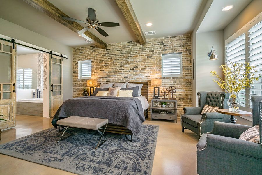
The Dash Custom Homes Website design has a layout that keeps the focus on the homes built by Dash Custom Homes. We truly wanted this website to showcase all of the beautiful homes by Dash Custom Homes.
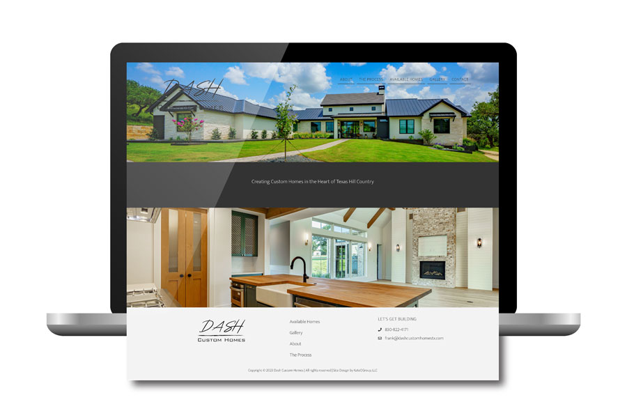
Located just outside of Austin, TX, Dash Custom Homes builds throughout the surrounding Texas Hill Country. At Dash Custom Homes, each and every home is constructed with a combination of careful craftsmanship and passionate design. This provides an individualized experience in creating your home. Each Dash Custom Home is so unique and custom. I really want anyone who visits the site to feel like they are actually walking through the homes as they look through the gallery.

The element I love most on this website is that a different room or home is featured at the top of each page throughout the website.

This simple and clean website design allows the photos and homes to really stand out without any distractions. I could scroll through these photos endlessly. I have yet to see any home designs I haven’t fallen in love with and am confident you’ll feel the same way.
Be sure to check out the beautiful new website for Dash Custom Homes. And see their gorgeous homes and finishes for yourself. Click here to virtually tour their homes.
Need a new website for your business? We love working with Home Builders and can’t wait to work with you!