This author web design for John R. Paine is a project I feel honored to have worked on.
I met John when I was a junior in high school. Not long after his oldest daughter and I became fast friends. Spending time at the Paine’s house is always so entertaining.
I can still remember the day, senior year of college, Amanda called to tell me that her dad had ALS. I had no idea what that was or exactly what that meant. She went on to tell me that John most likely had about 3-5 years to live.
Just over after 18 years after that phone call, John R. Paine, took on a new title: Author.
With the book release, he needed a website to serve as the hub for everything.
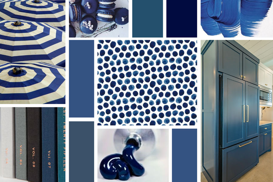
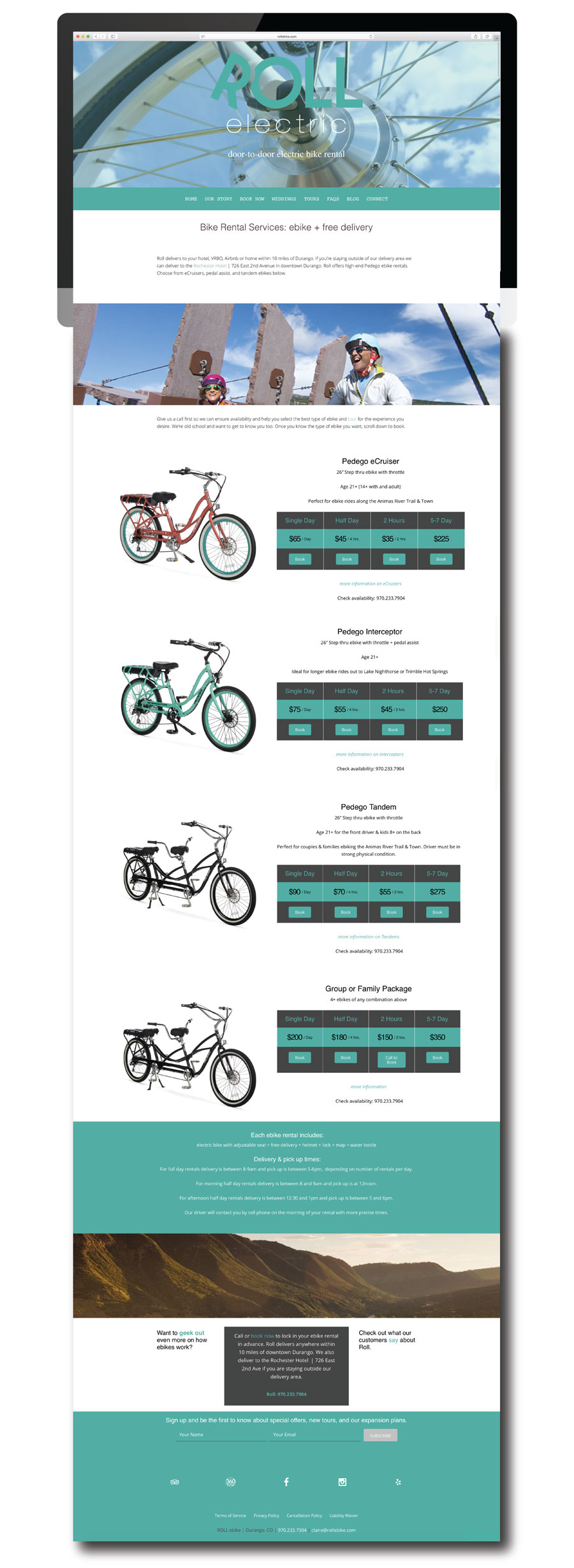
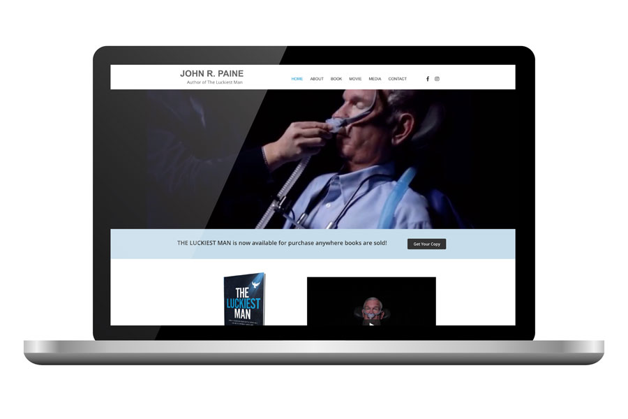
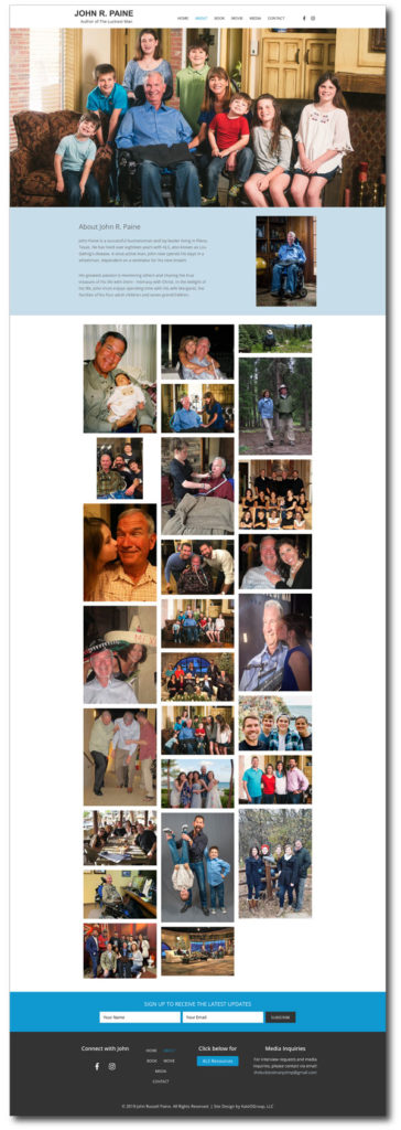
Author Web Design Project
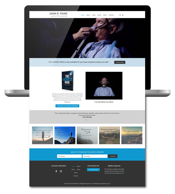
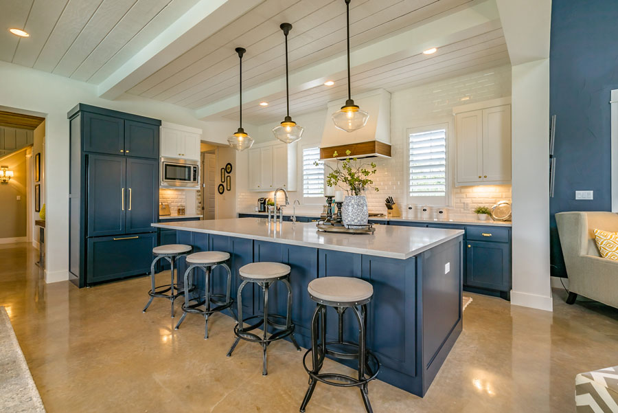
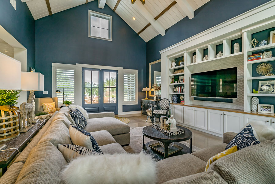
Here is a look at a few of the interior pages on Author John R. Paine’s website:
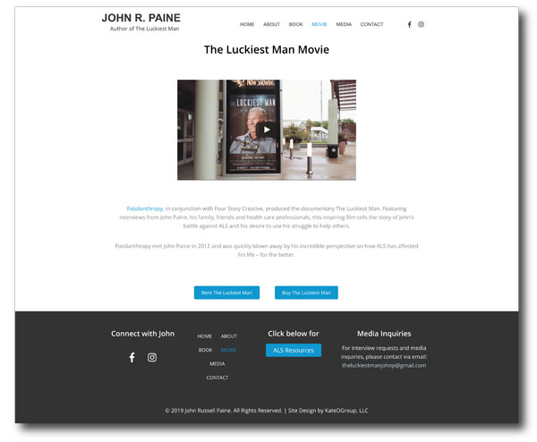
A few years before the book came out a local organization, Fotolanthropy, did a documentary on John’s life. We, of course, wanted to be sure and include information about that on his website.
You can head to John R. Paine’s website to explore the site and find out even more about this remarkable man. There will be more information about this author web design project in the portfolio very soon.
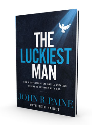
Or, you can head to your favorite spot for buying books and purchase your own copy of The Luckiest Man!
Ready to work with KateOGroup