Blog
The Color Green
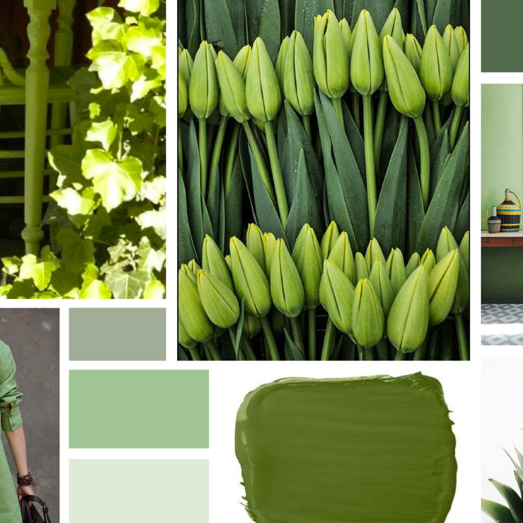
I have always loved the color green but rarely incorporate it into my everyday life. Each year when St. Patrick’s Day roles around I remember just how little green I own. In brand design, it is important to consider the meaning of the colors you use in your logo and branding elements. Green represents nature,…
Read MoreCheers with an Aperol Spritz
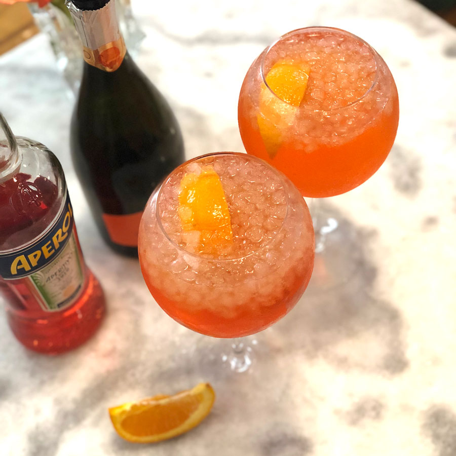
Before the debate sparked by the New York Times article, my friend Teal introduced me to the Aperol Spritz. I am already a fan of wine spritzers. My favorite way to create them is a Sauvignon Blanc with Waterloo Sparkling Water, preferably their new Strawberry flavor. When trying making an Aperol Spritz at home I…
Read MoreSugar Skull Logo: MASA Taqueria y Cantina
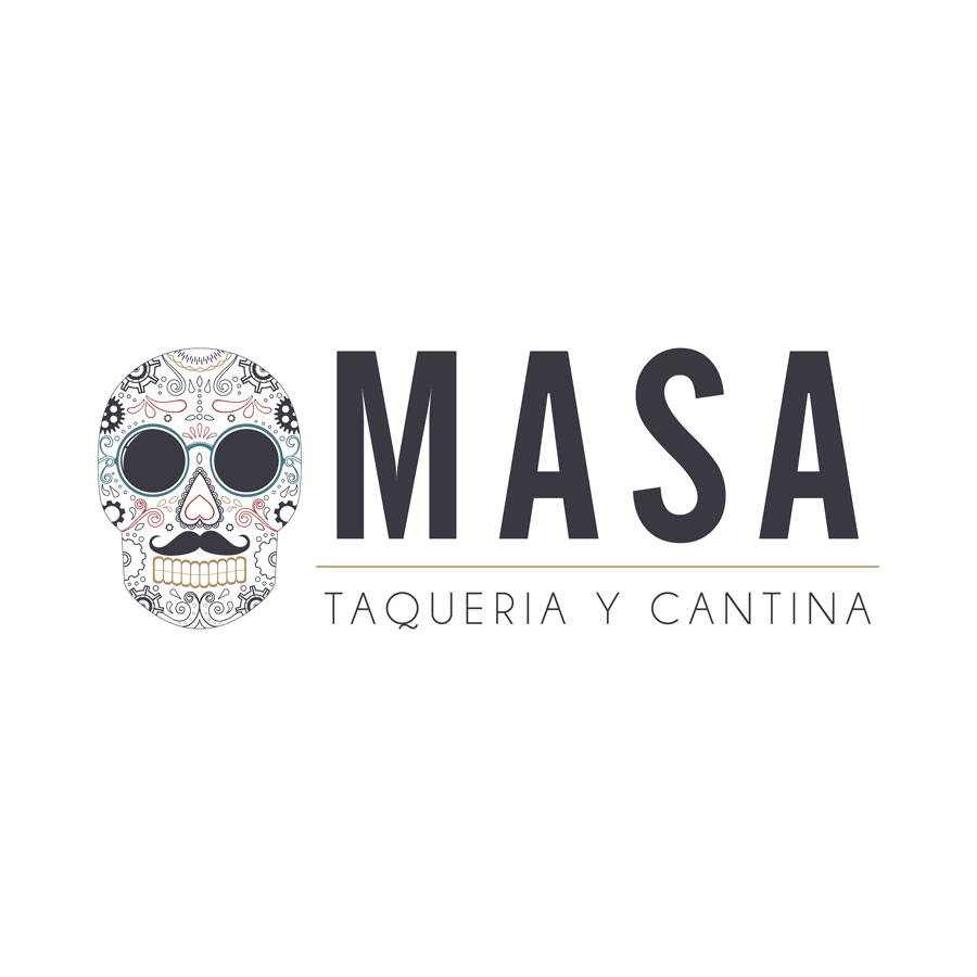
The owners had a concept in mind for the branding design that included a sugar skull logo and after a few rounds of revisions, I’m really happy with the end result. Sugar Skull Logo The logo consists of clean modern fonts that compliment the business of sugar skull. The primary logo colors are black and…
Read MoreRebrand: Barron Custom Design
Austin, TX Design Firm Rebrand for Barron Custom Design. Barron designs gorgeous homes throughout the Texas Hill Country. We have been working with owner Felicia and Barron Custom Design since 2013. In 2013, Felicia wanted a logo and updated website. This was such a fun project because we incorporated Felicia’s very first custom home design into…
Read MoreNonprofit Branding + Website Design: ABLE Foundation
KateOGroup had the privilege of working on the brand and website design for the ABLE Foundation.
Read More