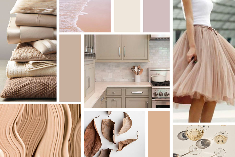
The Color Beige is a relaxing, neutral color that has a calming effect. It is a popular color used in interior design through a variety of textiles. Over the years there has been some confusion of exactly what color beige is. The image below is a representation of our understanding of beige.
Psychology of the Color Beige
It is said that if you prefer the color beige than you like the simple and basic things of life. You always choose to be back stage rather than out front for all to watch. Cleanliness, order and quiet are your main goals. You are also considered very dependable and tend to get along with everyone.
Beige has a calming effect. It is so often used by contractors in homes and business that almost all neutral colors are referred to as “Contractor’s Beige.” It is suggested that if you add a beige background or feature to a room to balance out bright colors, in two weeks you will feel a new sense of calm.
Beige in Design
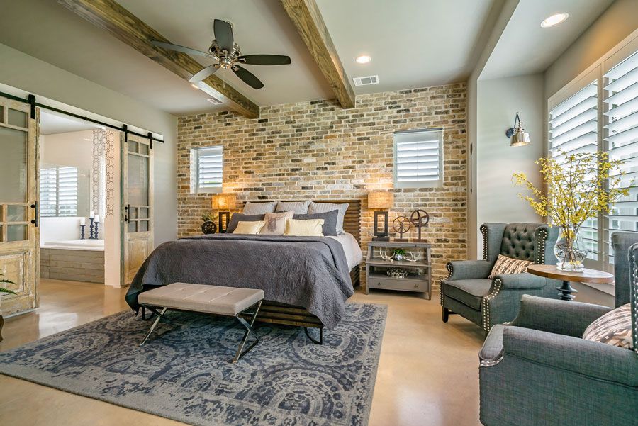
You can see in the image above how our client Agave Custom Homes used a beige color on the walls of the inviting master bedroom. There are quite a few colors in this design however beige balances out everything else.
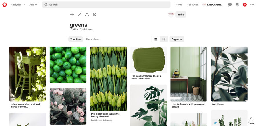
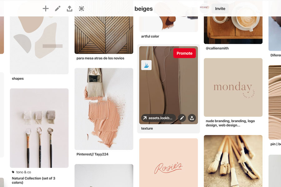
Finding Beige Inspiration
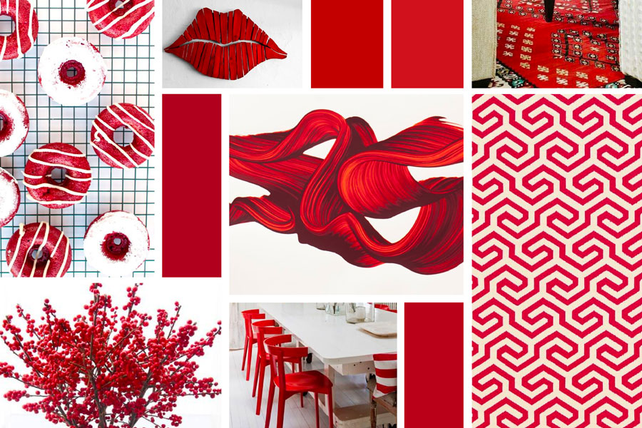
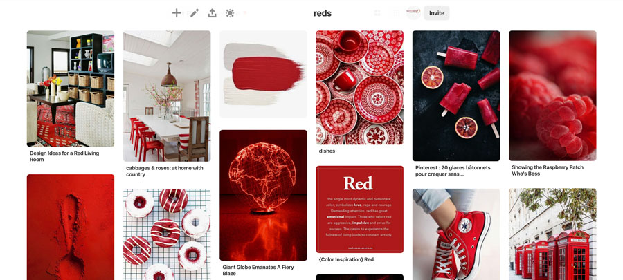
Visit KateOGroup on Pinterest and see our board titled Beiges. This board is full of inspiration. Nothing but variations of beige. All of the images in the first image are on the Beiges Pinterest Board.
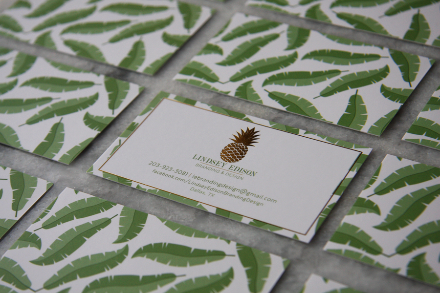
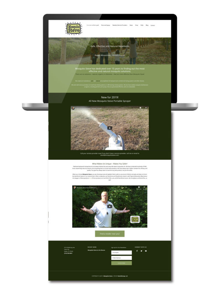
Over the next month we will be highlighting designs by KateOGroup, both branding and website, that incorporate the color beige. Be sure to follow us on Instagram.
Want to learn more about other color features on our blog? Click here.