• Skip to main content
KateOGroup-Logo
  • Home
  • About
  • Services
    • Custom Branding Design Services by KateOGroup
    • Custom WordPress Website Design
    • Design & Maintenance Services
  • Portfolio
  • Resources
  • Blog
  • Contact

Our Work

Jan 07 2019

Nonprofit Branding + Website Design: ABLE Foundation

This nonprofit branding design for ABLE Foundation was such a labor of love.

I was so excited to have the opportunity to work with my friend Nicole on the brand and website design for the ABLE Foundation. It is so cool to know people who do really awesome things!

March 23, 2018, Nicole’s son Abe (13 months old) was hit by a car. He had skull fractures, a brain bleed, 7 broken ribs, damaged lungs, liver and spleen contusions and spent 22 days in the PICU. Miraculously, Abe survived. If you saw him on the playground you would have no idea all that he has gone through. To read more about the ABLE Foundation click here.

This fall, Nicole had the idea to start the ABLE Foundation to raise money to support other families with a child in the PICU and their caregivers. I had the privilege of working on both the brand and website design.

Nonprofit Branding Design

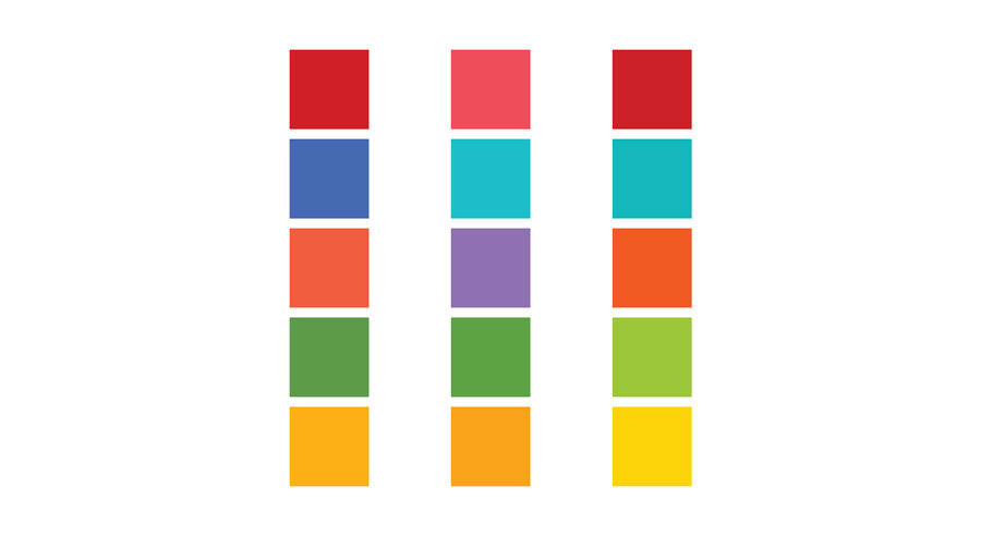
The ABLE Foundation is about kids and for kids, so I wanted the color palette to be fun and bright. I pulled together a few options for us to choose from:
I created several logo options and put each design in each color palette. Then the committee members voted on both the color and design.
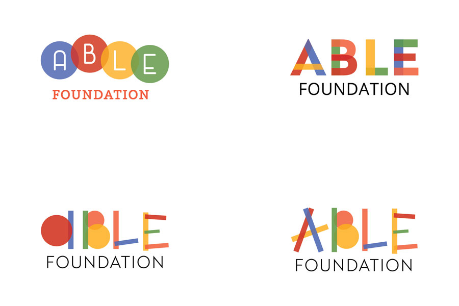
brand and website design for ABLE Foundation by KateOGroup

Once the logo was chosen, I built the website so that we were able to sell tickets to the 1st Annual ABLE Foundation event on January 19, 2019.

In about two weeks all but about 30 tickets have been sold! If you’re local to the Dallas area and would like to attend, be a sponsor or donate click here to find out how. I can’t wait for this event and see how much money we raise!

Ready to work with KateOGroup

Let’s Get Started

Written by Kate O. Lynch · Categorized: Blog, Custom Branding, Our Work, Website Design · Tagged: brand design, logo design, website design

Dec 01 2018

Two 29 on the Square Event Venue Custom Branding

This event venue custom branding design was created for an event planner we designed a logo for. She had the opportunity to open an event venue and came back to us for the logo design.

Two 29 is the street number for the venue and it is located on the town square. Loved the clever conception of the business name. From the beginning we discussed that the color palette would be only black and white so that the focus would always be on the events.

Event Venue Custom Branding for Two 29 on the Square

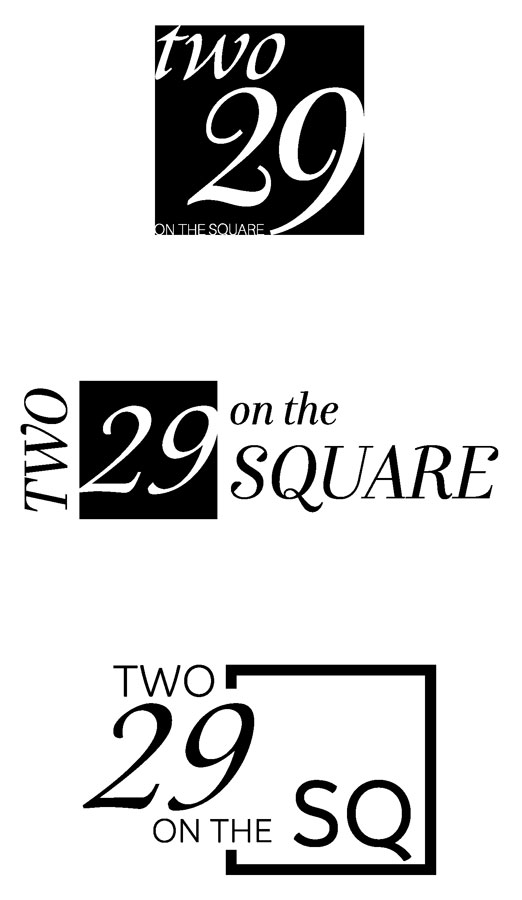
Here is a look at the first draft of ideas for the logo:

Event Venue Custom Branding for Two 29 on the Square

After narrowing down the concepts to the first and third, the final choice was:

If you are near Celina, TX and looking for a venue for your next event be sure to check out Two 29 on the Square.

Ready to work with KateOGroup?

Let’s Get Started

Written by Kate O. Lynch · Categorized: Blog, Custom Branding, Our Work

Nov 13 2018

Custom Branding for Home Builder

Classic and simple was the goal for this custom branding project for Grandview Custom Homes in the Texas Hill Country.

After years in the home building industry, Taylor O’Brien started Grandview Custom Homes in 2013.

Written by Kate O. Lynch · Categorized: Blog, Custom Branding, Our Work

Jan 10 2017

Jennifer Foster Marketing | Branding + Website Design

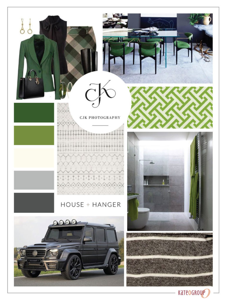
This monogram logo design project for Jennifer Foster started with a quick exchange of ideas over email. I started the project with this moodboard for inspiration.

We often collaborate with Jennifer on various projects. From the design of marketing materials to web design for clients.

Monogram Logo Design

Working with only two initials in a monogram makes it easy to creatively combine the letters. Most of Jennifer Foster Marketing’s clients are corporate. Because of this, she needs her logo to have a clean crips look rather than a whimsical look.

For this logo design project having various mark options is important so that Jennifer always has a version of her logo to use in any situation. For example, social media, letter head, watermarks, etc.

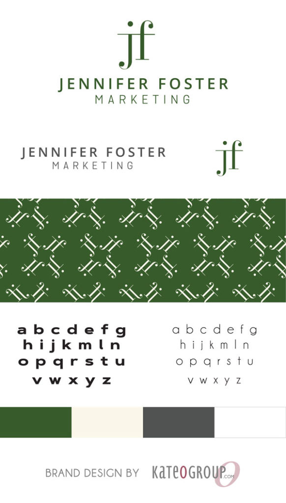
The color scheme for this brand incorporates greens and greys portraying stability and balance. As a result, to me this means authority and expertise. If you are stable and balanced then you can withstand the test of time.

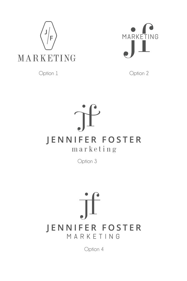
After a few rounds of revisions Jennifer ultimately made her selection for her logo design. Below are the final designs presented to Jennifer before the final selection was made.

Here is a look at the final logo design for Jennifer Foster Marketing:

In addition to a logo, Jennifer needs a business card. Just like the logo the design is clean and crisp.

Web Design for Jennifer Foster Marketing

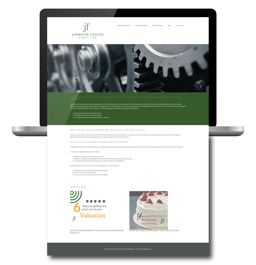
Creating a simple wordpress web design began after the logo selection was made. This site introduces Jennifer Foster Marketing and it’s services. Additionally it allows Jennifer to easily blog.

Visit Jennifer Foster’s website for more information about Jennifer and her services. Click here.

Ready to work with KateOGroup

Let’s Get Started

Written by Kate O. Lynch · Categorized: Blog, Custom Branding, Our Work, Website Design

May 06 2016

Sonya Renee | Custom Rebrand

This jewelry logo design project for Sonya Renee Jewelry was a collaboration with Lindsey Edison Branding & Design. The Sonya Renee Jewelry Rebrand was such a fun project!

Lindsey and I got together over a cup of coffee to brainstorm the colors and style.  After perusing Pinterest for inspiration we settled on Rose Gold and black.  As we went through the design process the black eventually became more of a dark grey.

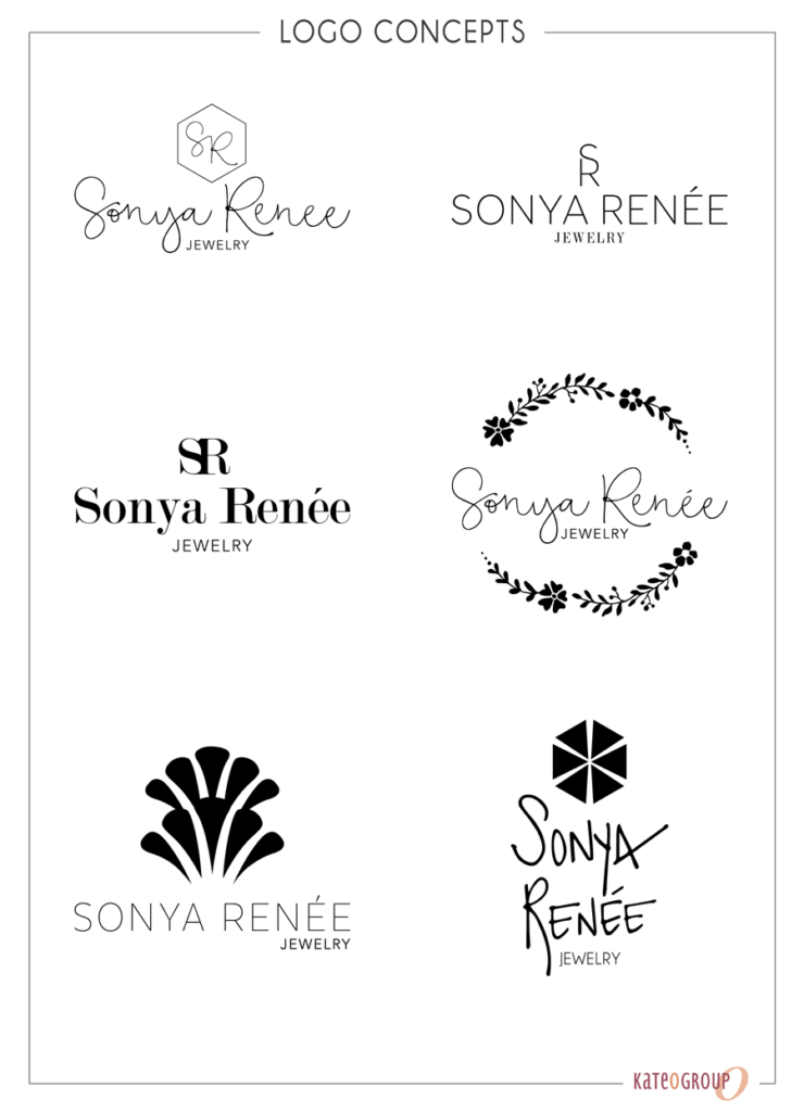
Here’s a few of the initial logo concepts presented to the client:

jewelry log design

New Jewelry Logo Design for Sonya Renée

With the logo selected it was time to complete the branding process. This is where the real fun starts!

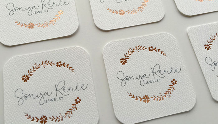
To compliment the gorgeous Rose Gold foil the paper we use for the business cards, stationery and belly bands has this amazing texture. It gives the pieces a bit of a natural look that is balances the foil to give this design an approachable feel.

Heres a look at a few of the additional marketing pieces we created: business cards, packaging and stationery.

jewelry logo design

In addition to the items above, we also created a look book for Sonya Renee’s first launch following the new jewelry logo design.

The combination of Rose Gold and Pewter gives this Sonya Renee Jewelry Rebrand such a whimsical and feminine feeling.  If you need some new jewelry for yourself or for a gift be sure to visit Sonya Renee Jewelry!

Ready to work with KateOGroup
Written by Kate O. Lynch · Categorized: Blog, Custom Branding, Our Work

  • « Go to Previous Page
  • Page 1
  • Page 2
  • Page 3
  • Page 4
  • Go to Next Page »

Get In Touch!

howdy@kateogroup.com

Sign Up to Receive Our Newsletter

!
!
Subscribe
Something went wrong. Please check your entries and try again.

Follow Us

© 2025 KateOGroup | All Rights Reserved