• Skip to main content
KateOGroup-Logo
  • Home
  • About
  • Services
    • Custom Branding Design Services by KateOGroup
    • Custom WordPress Website Design
    • Design & Maintenance Services
  • Portfolio
  • Resources
  • Blog
  • Contact

logo design

Jan 07 2019

Nonprofit Branding + Website Design: ABLE Foundation

This nonprofit branding design for ABLE Foundation was such a labor of love.

I was so excited to have the opportunity to work with my friend Nicole on the brand and website design for the ABLE Foundation. It is so cool to know people who do really awesome things!

March 23, 2018, Nicole’s son Abe (13 months old) was hit by a car. He had skull fractures, a brain bleed, 7 broken ribs, damaged lungs, liver and spleen contusions and spent 22 days in the PICU. Miraculously, Abe survived. If you saw him on the playground you would have no idea all that he has gone through. To read more about the ABLE Foundation click here.

This fall, Nicole had the idea to start the ABLE Foundation to raise money to support other families with a child in the PICU and their caregivers. I had the privilege of working on both the brand and website design.

Nonprofit Branding Design

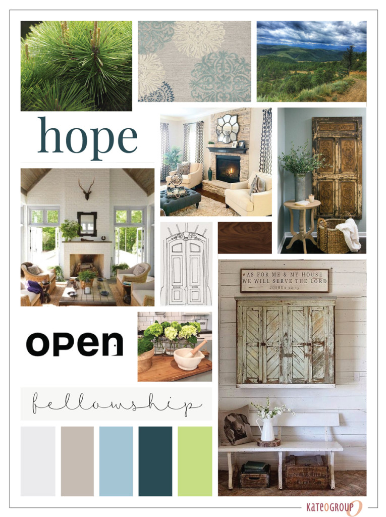
The ABLE Foundation is about kids and for kids, so I wanted the color palette to be fun and bright. I pulled together a few options for us to choose from:

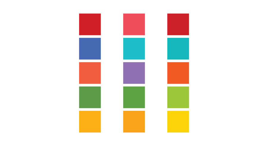
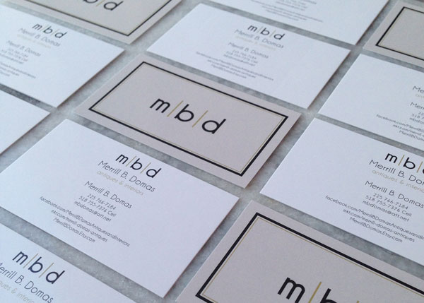
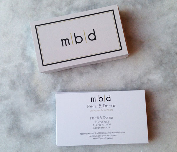
I created several logo options and put each design in each color palette. Then the committee members voted on both the color and design.

brand and website design for ABLE Foundation by KateOGroup

Once the logo was chosen, I built the website so that we were able to sell tickets to the 1st Annual ABLE Foundation event on January 19, 2019.

In about two weeks all but about 30 tickets have been sold! If you’re local to the Dallas area and would like to attend, be a sponsor or donate click here to find out how. I can’t wait for this event and see how much money we raise!

Ready to work with KateOGroup

Let’s Get Started

Written by Kate O. Lynch · Categorized: Blog, Custom Branding, Our Work, Website Design · Tagged: brand design, logo design, website design

Sep 19 2016

Moodboard Monday: Dreamy Sophistication

Moodboards play such an important when I begin a design project.  Whether it’s a logo or a website, this is where I like to start.  The Moodboards I’m sharing today have dreamy sophistication.

I love this Nantucket inspired color pallet.  These weathered wood textures add so much character.

nantucket-moodboard-dreamy-sophistication

This moodboard was so much fun to create. It was designed for a project for a new business in the flooring industry. All of the patterns and textures…I just love the endless possibilities they represent.  As different as the moodboard below is from the one above, to me it also represents dreamy sophistication.

mood-board


Every time I start a new moodboard, the first place I go is to Pinterest.  I start gathering images and bringing them into Illustrator.  As I put them side by side I can see if they really create the story I’m trying to create for my customer.  Do they evoke the look and feel the brand represents?  I typically have a color pallet in mind when I start a project but it evolves as the moodboard comes together.

Written by Kate O. Lynch · Categorized: Blog, Branding & Design · Tagged: brand design, branding, flooring, logo design, moodboard, moodboard monday, nantucket

Jul 13 2016

Rebrand: Charlie & Jake’s

Confession.  Every time I complete a project it becomes my favorite project.

Though I have to say it might take a little bit for anything to top this rebrand project.  That is simply because I got to do so many things with this project and they were all so much fun!

First step of course was determining the mood and style of this rebrand through the moodboard:
Charlie-&-Jake's-Mood-Board
Charlie & Jake’s is a Barbecue restaurant near Florida’s Intracoastal Waterway that relocated this year (just down the street).  Along with the relocation the logo got a revamp.  The original Charlie & Jake’s logo was a bit whimsical and fun:
Charlie-&-Jake's-original-logo
With the rebranding the owners where looking for a more modern design that would accompany the expanded menu.  We tried several variations with just a pig, with no pig and ultimately decided to incorporate both a big and a cow.  Here’s a look at a few of the options we explored as we worked through the design process:
Charlie-&-Jake's-Logo-Concepts
I was so glad I didn’t have to be the one to choose the final logo.  I’m not sure I would have been able to decide!

Charlie-&-Jake's-Logo-&-Elements

But once the logo was chosen the real fun began!

Charlie-&-Jake's-Street-Sign

Charlie-&-Jake's-Restaurant-Outside

Charlie-&-Jake's-Menu

Charlie-&-Jake's-Drive-Thru-Menu

This rebrand included giving the website a new look as well.  Be sure to check out the brand new Charlie & Jake’s site. In the mean time here is a look at the home page:

Charlie-&-Jake's-Website

We’ve still have a few more printed items to wrap up so be sure to head to the portfolio because I’ll be adding the additional work there.

Since I live in Texas, no where near Charlie & Jake’s, someone go visit and tell me all about how amazing the food is!

All photos by Yap Originals.

Written by Kate O. Lynch · Categorized: Blog, Branding & Design, Custom Branding · Tagged: bbq restaurant, Charlie & Jake's, Florida restaurant, logo design, rebrand, rebranding

Mar 21 2016

Moodboard Monday: Homey

Whenever I’m brainstorming a new project, I like to start with a moodboard.  It really helps me to establish the direction and message for the upcoming design.  I haven’t meet with my clients yet, so I’m not sure this moodboard will be what I use going forward but still thought I’d share it incase it provide inspiration for someone else!

Homey_Moodboard

Through this moodboard I wanted to establish a “homey” feel with the opportunity for personal touches throughout the design.  This is the first step in a rebranding and website design.

Want to see even more sneak peeks of the projects I’m working on?

Follow me on Instagram

or Snapchat: KateOGroup

Written by Kate O. Lynch · Categorized: Blog, Branding & Design · Tagged: brand design, branding, Branding Design, logo design, moodboard

Nov 03 2015

Logo Design: Merrill B. Domas

The Logo Design for Merrill B. Domas was another project I worked on with Lindsey Edison Branding & Design.  The idea and concept for Merrill B. Domas Antiques & Interior Design was centered around art deco design and using classic colors.  This was such a fun design I went about over the top on design ideas, but here’s a peek at that final five designs:

Logo Design: Merrill B. Domas Concepts

Merrill-B.-Domas-Logo-&-Elements

Once the logo design was complete it was time for the business card design.  I love the minimalist look of this modern design and how that translated to the finished card design.

Merrill-B-Domas-Business-Cards-1

Merrill-B-Domas-Business-Cards-2


If you are looking to get started on branding for your business we would love to talk with you.  Leave a comment below and I will email you to set up a time to talk.

Written by Kate O. Lynch · Categorized: Blog, Custom Branding · Tagged: art deco, black and gold, branding, Branding Design, business card design, business cards, logo design, retro logo

  • Page 1
  • Page 2
  • Go to Next Page »

Get In Touch!

howdy@kateogroup.com

Sign Up to Receive Our Newsletter

!
!
Subscribe
Something went wrong. Please check your entries and try again.

Follow Us

© 2025 KateOGroup | All Rights Reserved